Creating freedom from convention,
for The Prisoner Wine Company.
The Prisoner Wine Company (TPWC) has always had an unconventional approach to winemaking and design. Founded in 2000 by legendary winemaker, David Phinney, it’s one of Napa Valley’s biggest success stories. The first label ‘The Prisoner’ features the imposing Goya etching titled ‘Le Petit Prisonnier’. The visual protest in the image speaks to the brand’s rebellious, trailblazing style and desire for creative freedom from tradition.
Today, their winemaking philosophy remains true to this first venture: a renegade style of bolder, fruit-forward wines from high-quality grapes is made for contemporary tastes. This inspires the TPWC brand to disrupt in a category dominated by traditional brands.

Our brief was to create the branding and packaging for a new range of wines called ‘Unshackled’. These expressive wines, born of TPWC’s ground-breaking ethos, were a match for the unconventional wine lover to enjoy the freedom of their wine moment. Furthermore, the brand itself had an overall ambition to drive higher volumes at an entry-level, luxury wine price point.
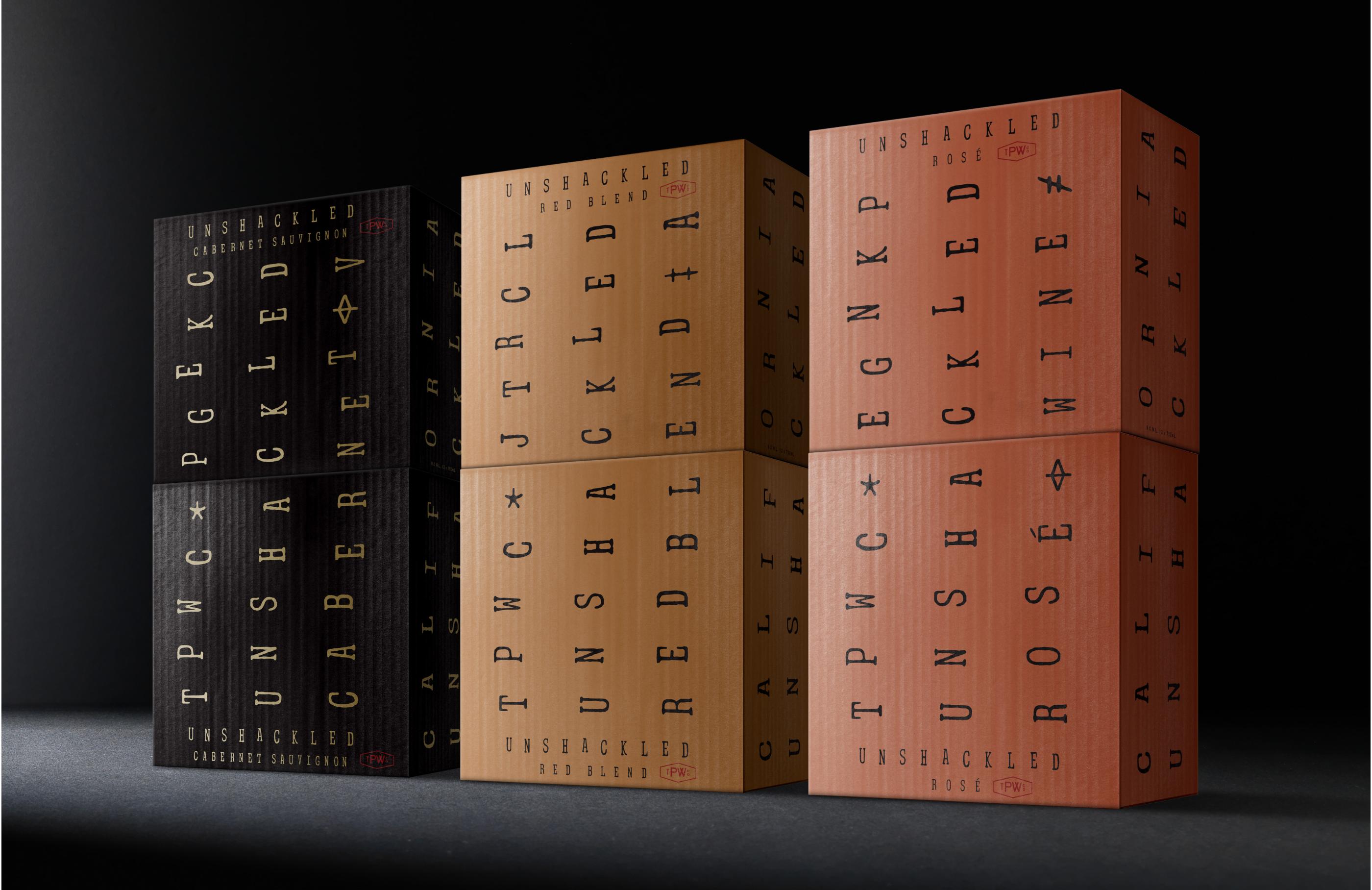
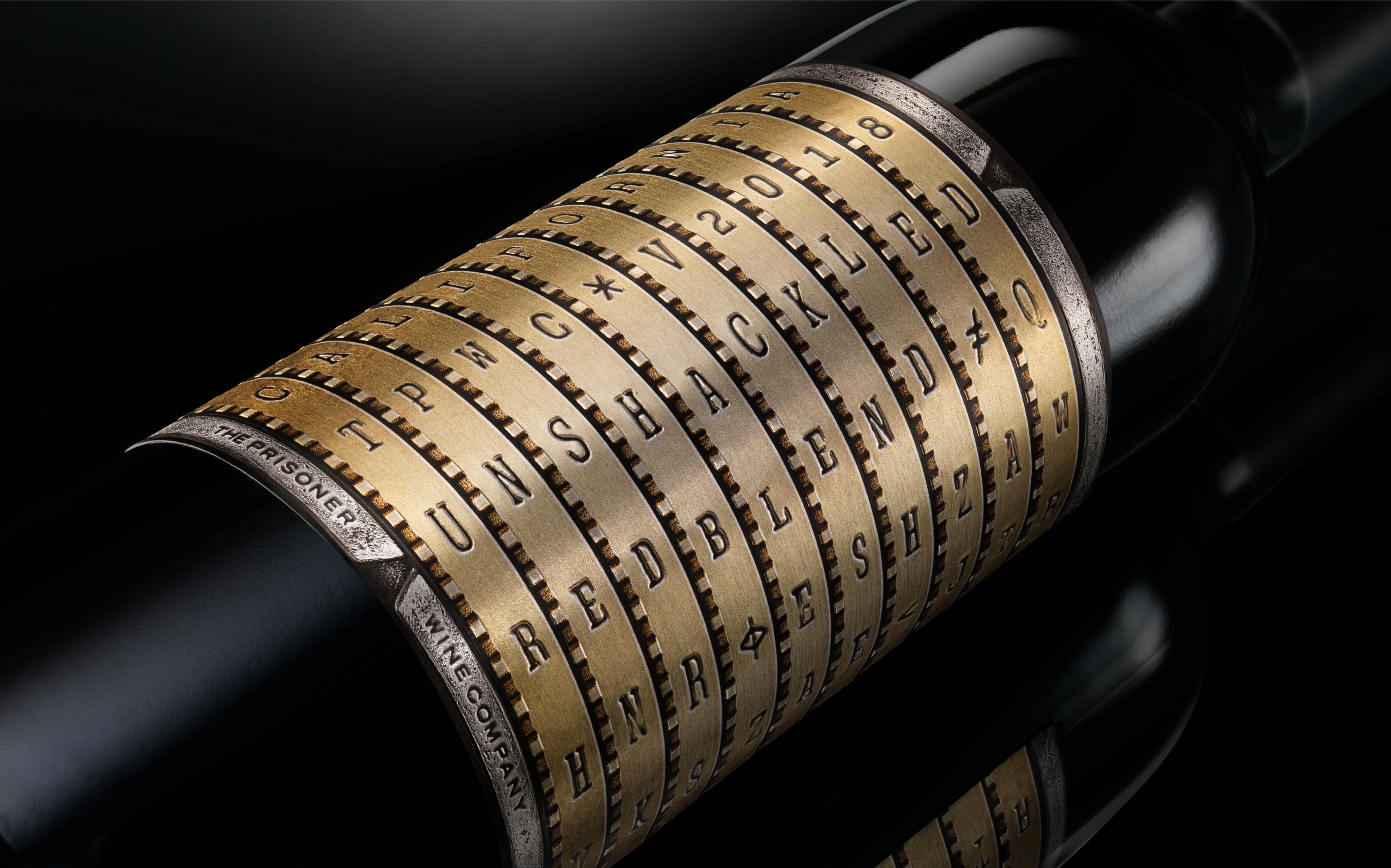
Unshackled and unconventional

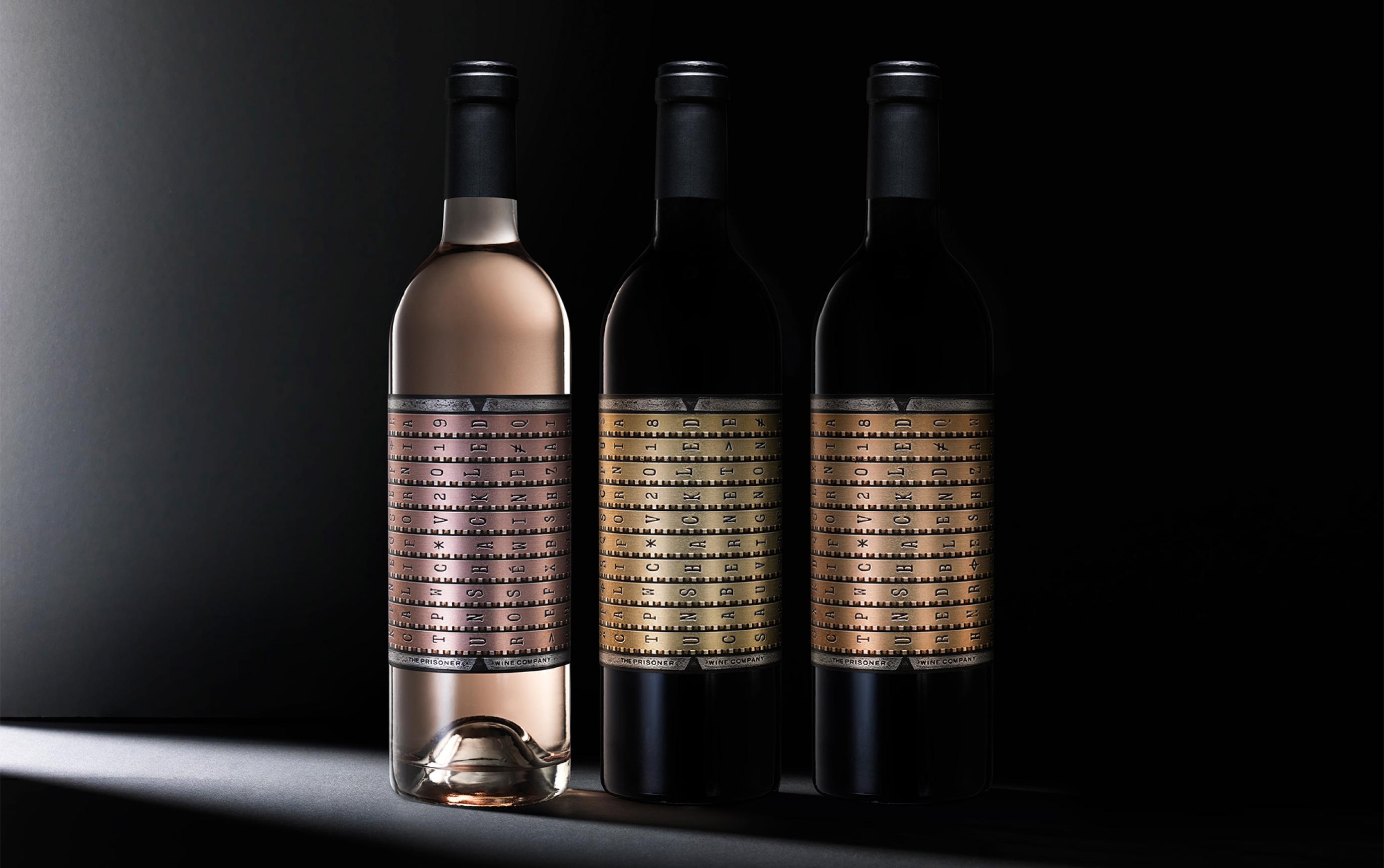
Our idea that ‘freedom is a state of mind’ inspired design thinking. Drawn to the notion that freedom can be found when the power of positive thought breaks through, we landed on a combination lock design. Unlocking at ‘UNSHACKLED,’ this is an unforgettable symbol of freedom - bold and visually arresting, it is unmistakably of TPWC’s aesthetic and attitude.

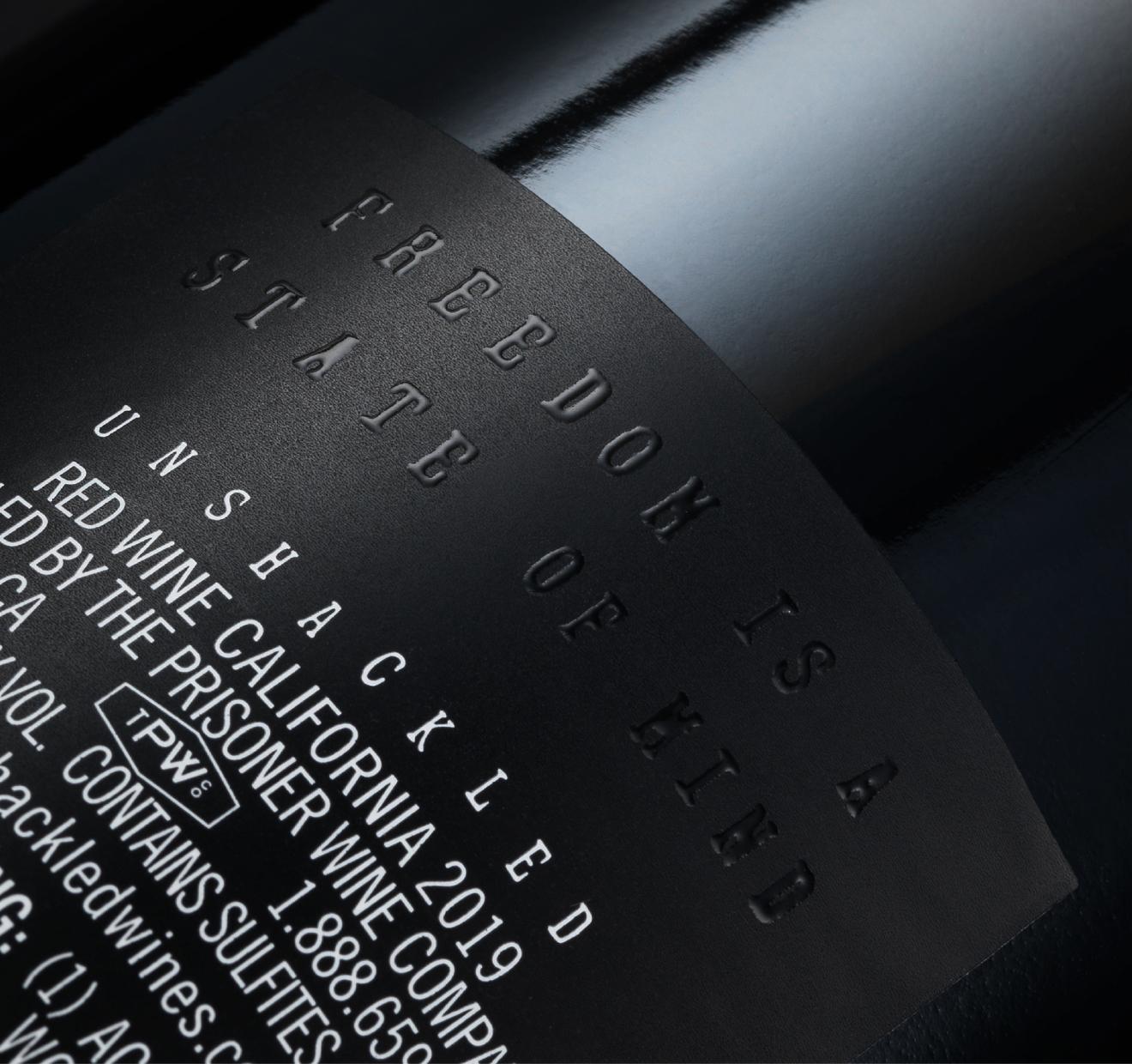
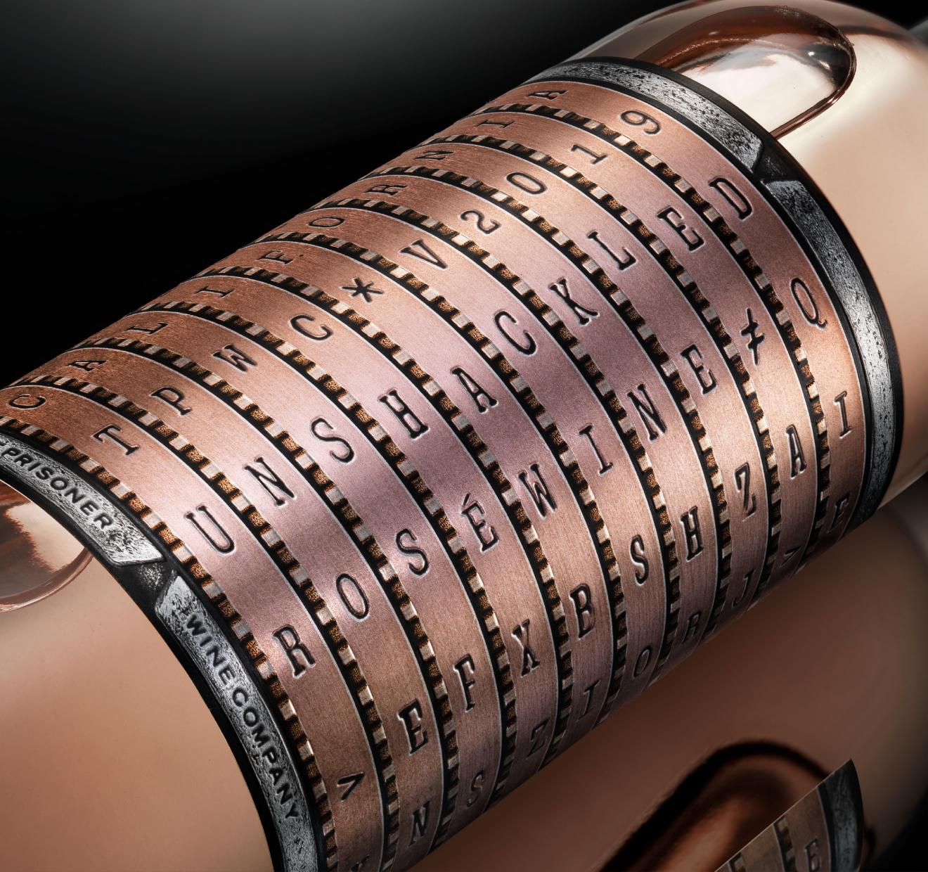
Technically, we pushed capabilities in print production to meet the needs of high-speed bottling lines, as well as the cost of goods. Ensuring we helped the brand deliver luxury within budget. The super-premium look and feel is striking on the shelf and extra tactile in your hand.