Here’s to a new type of drinks brand. One that engages Australians in climate change issues, by empowering them to regenerate the Great Barrier Reef.
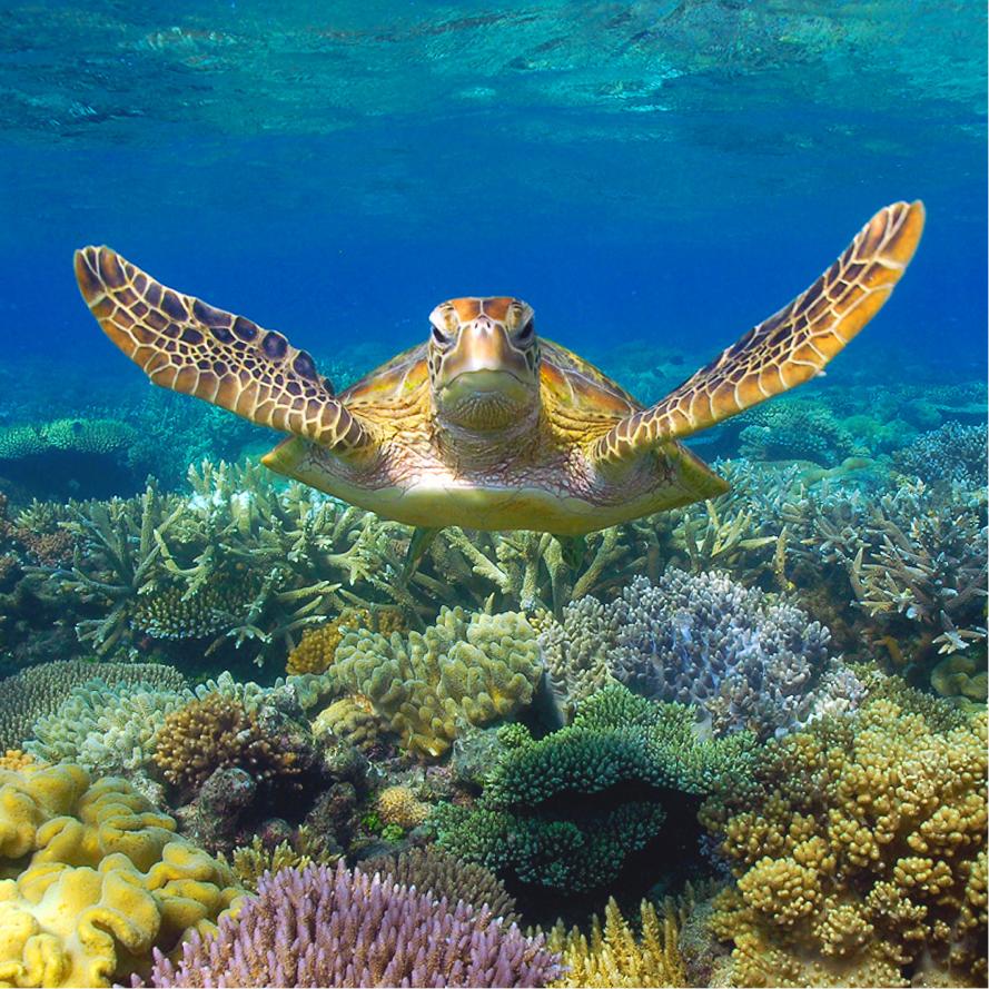
As one of the world’s seven natural wonders, the Great Barrier Reef is the single biggest living structure on the planet. Unfortunately, its future is uncertain. With rising sea temperatures and human-made pollution, one third of the reef has already been damaged by bleaching.
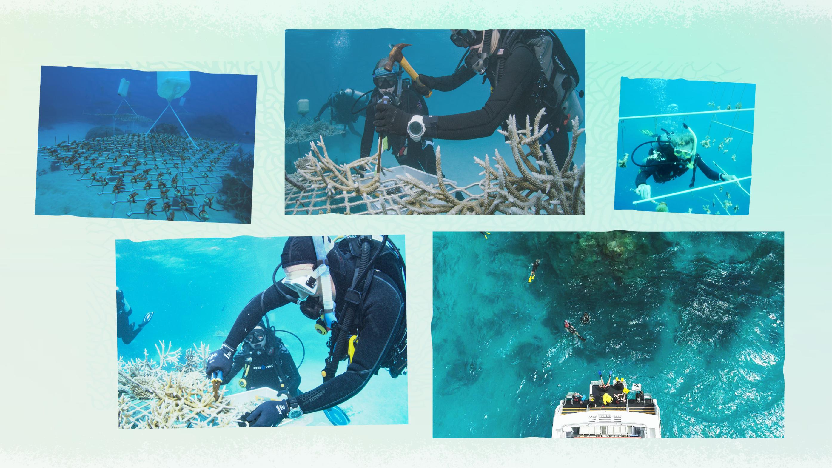
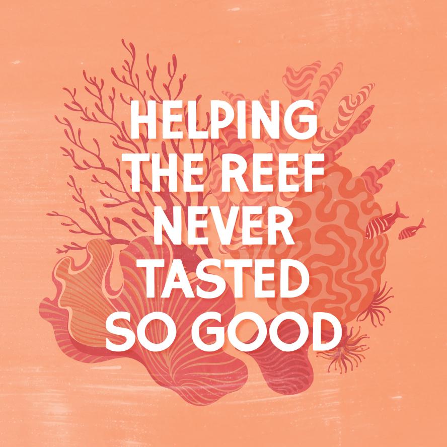
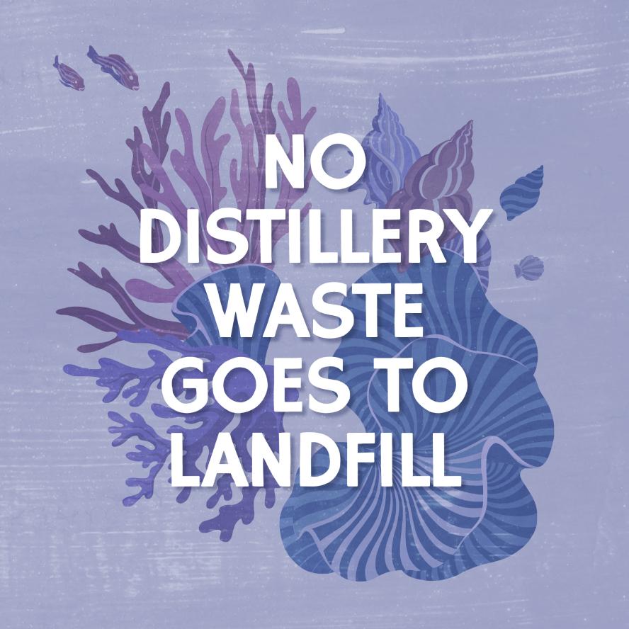
There is some good news. The reef is resilient. But it desperately needs our intervention. Reeftip, with its distillery at the tip of the reef, is in a unique position to help. Not only do they make delicious drinks that hero the unique flavours of Australia, they donate 10% of profits to the Coral Nurture Program who grow and replant coral across the Great Barrier Reef. We partnered with Reeftip to create a sustainable brand that not only refreshes people but helps refresh the reef too.

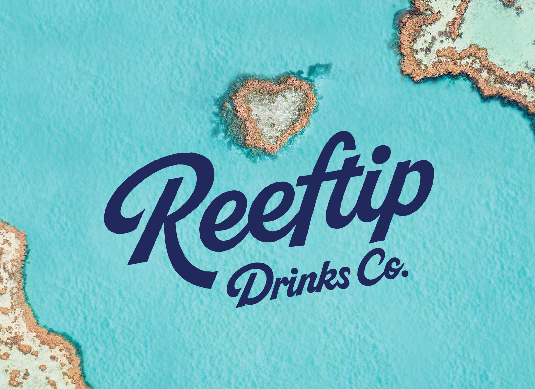

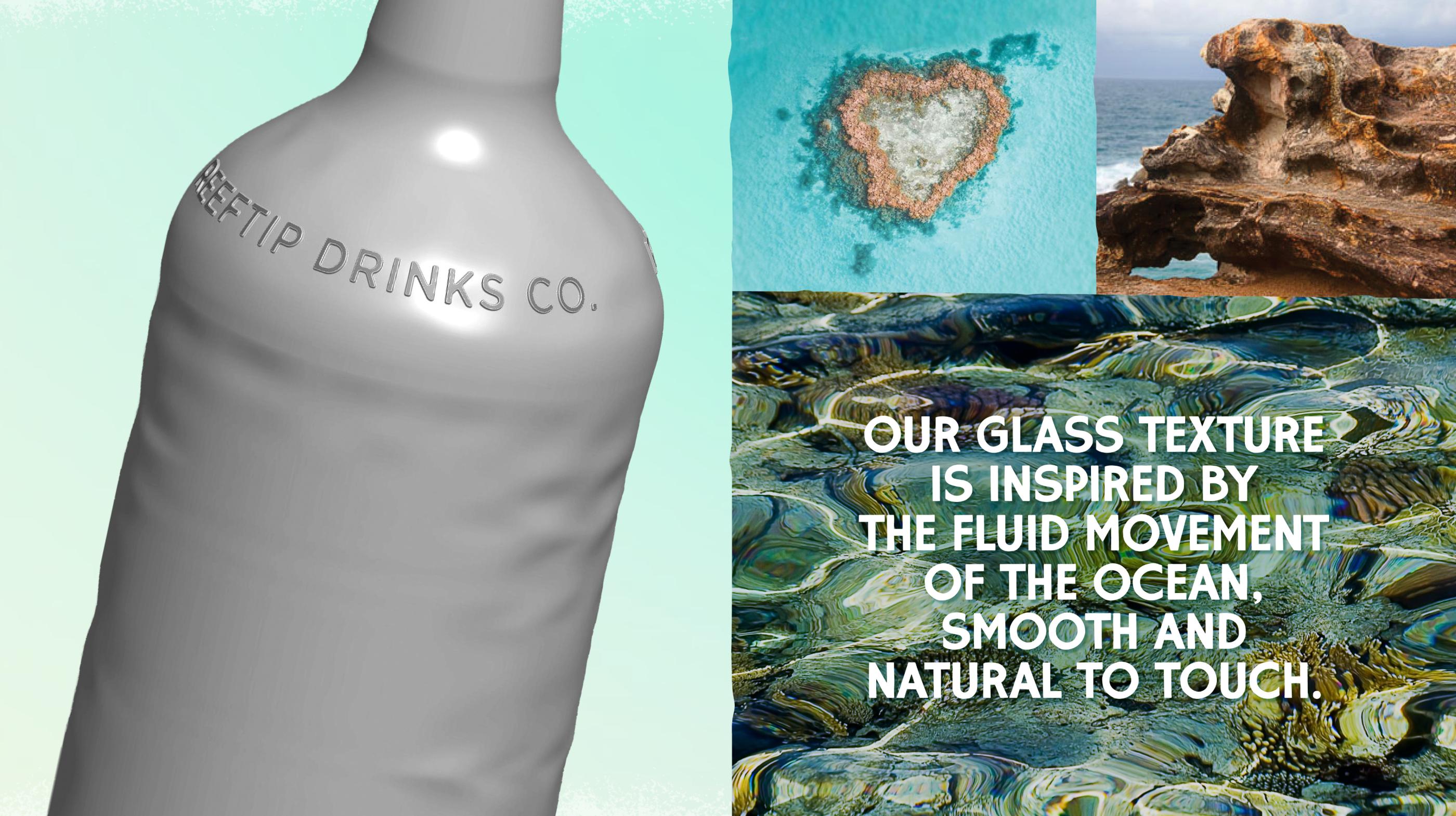
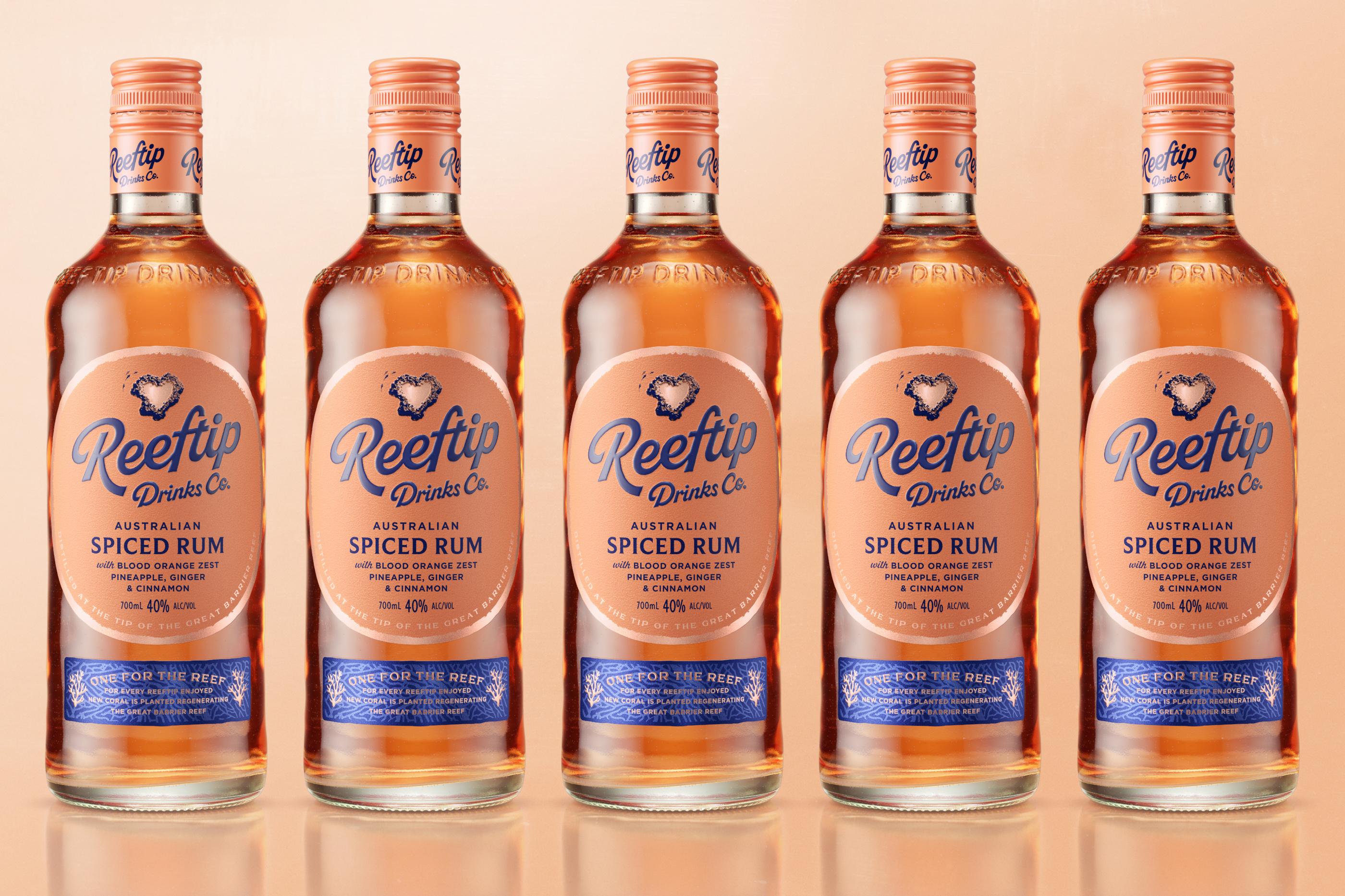
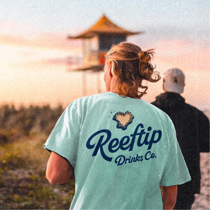
In creating the brand, Reeftip’s optimism and the vibrancy of the reef itself became our inspiration. The Whitsundays’ iconic heart-shaped reef was a natural fit for a brand icon. As a beacon of positivity, it perfectly captures the brand’s personality and purpose. Using a tangible place as an icon also serves as a constant reminder that the reef is alive and at the heart of the brand and its mission.
Donating 10% of profits to the Coral Nurture program

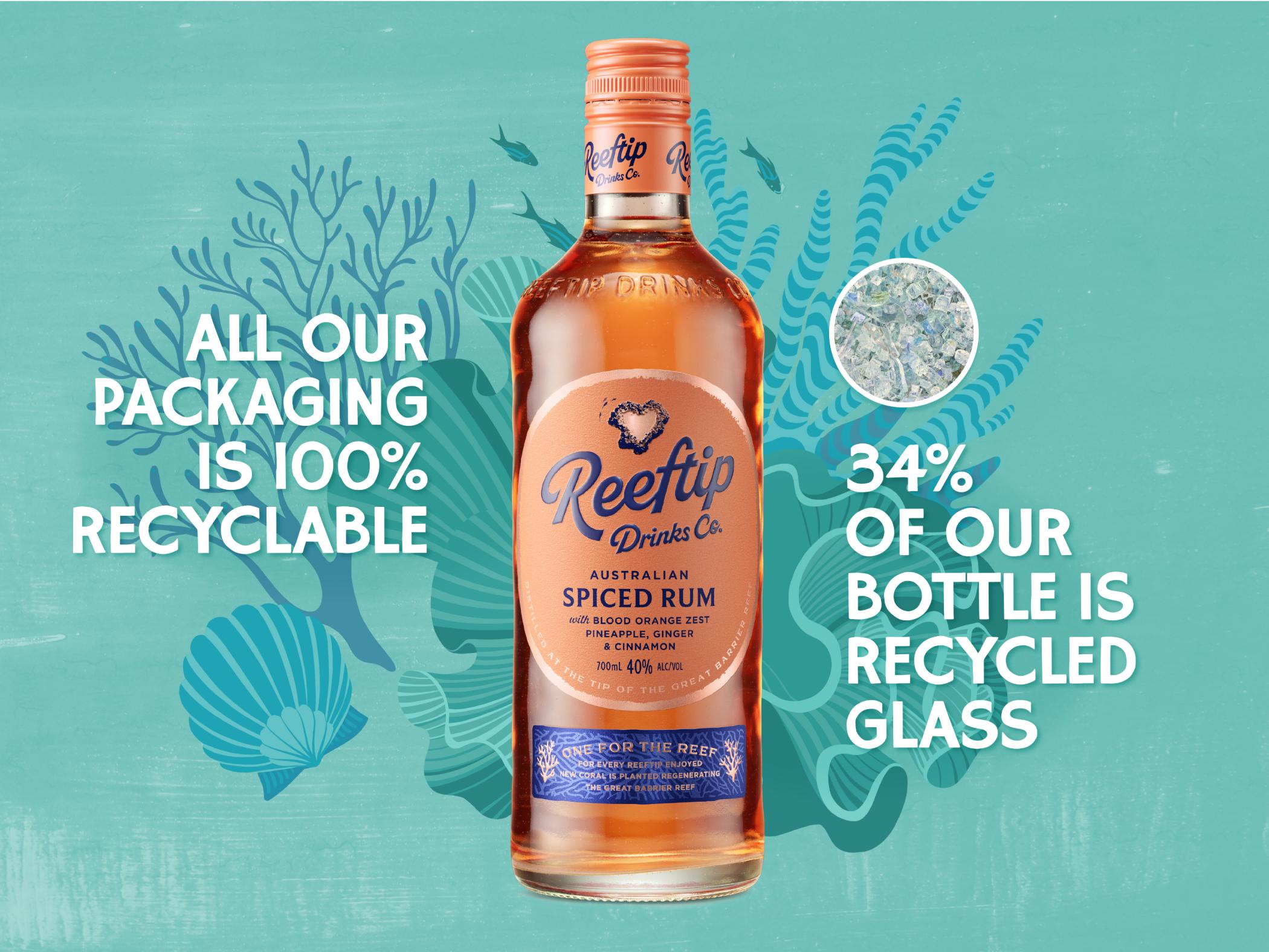

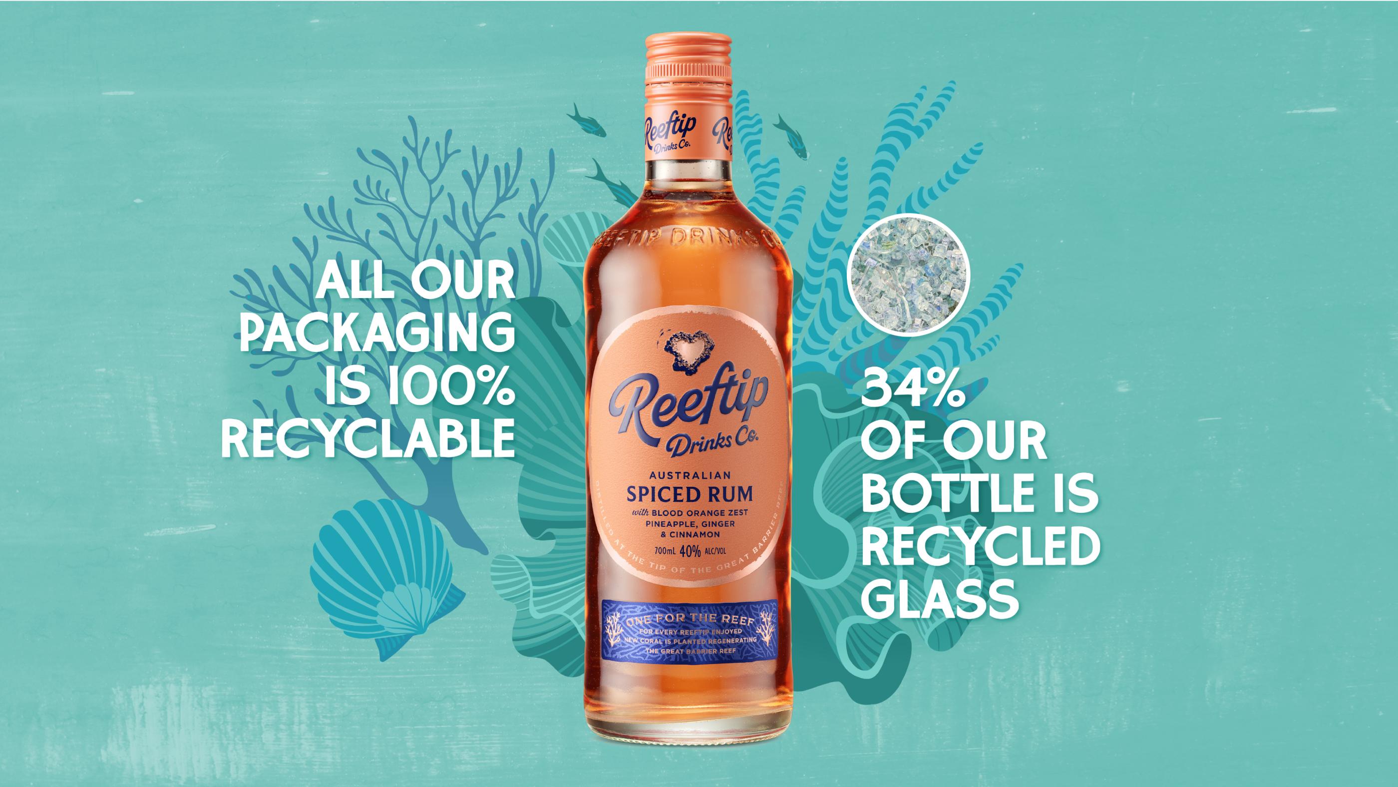
The brand and our design principles were built in harmony with the reef. The values of the new visual identity shaped the packaging design. And the naturally uplifting colour palette reflects the reef’s abundant life and energy. Notably, we made a conscious decision to not use white—the colour of lifeless coral after a bleaching event.
Embracing the imperfect beauty in nature


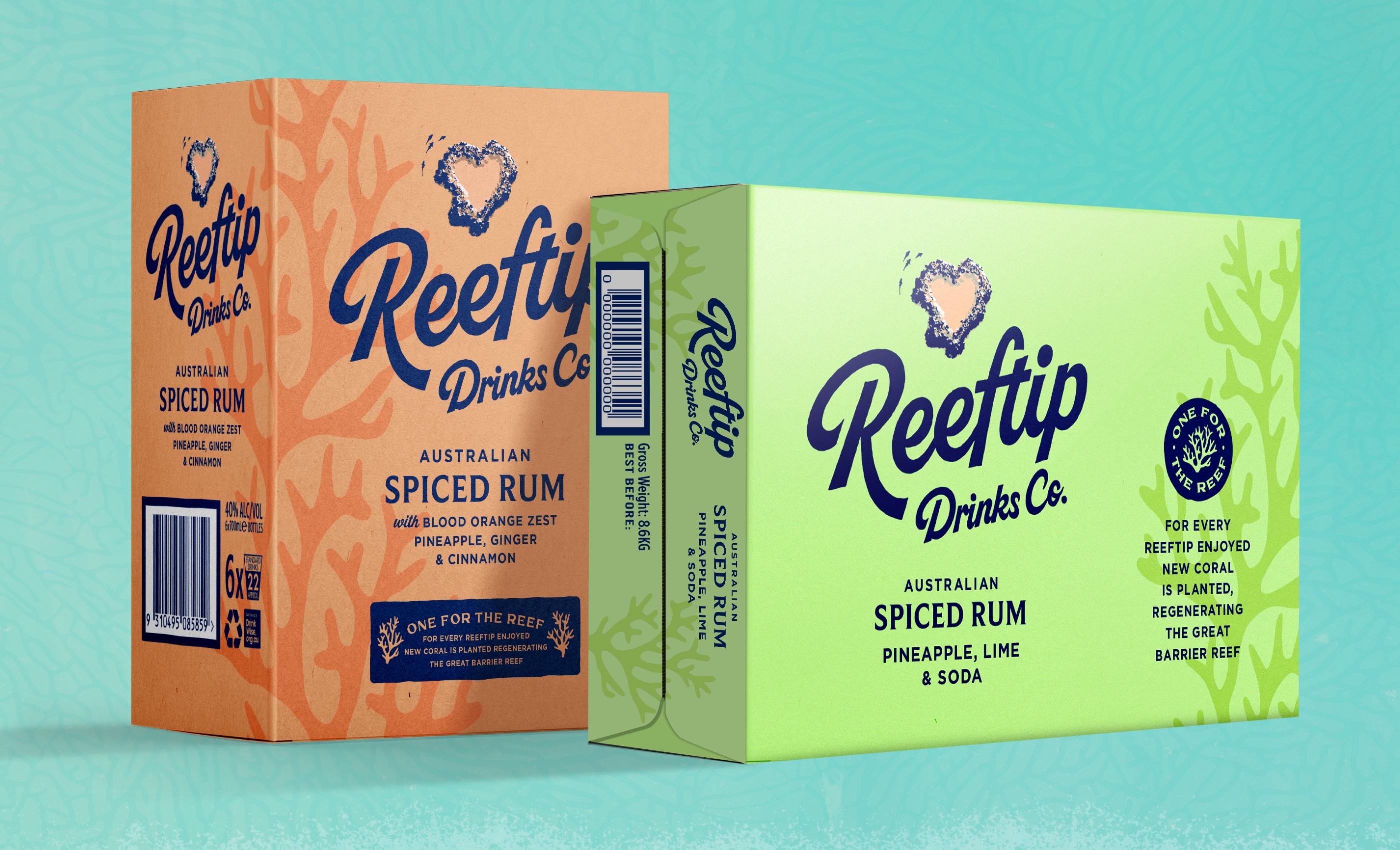
The bottle design has to tick multiple boxes. Not only does it have to be technically feasible and deliver brand storytelling and aesthetic appeal, its shape has to be future-proofed for further variants. The first product release is an Australian Spiced Rum, however the ambition is for Reeftip to be able to offer a variety of spirit styles and work across multiple categories.
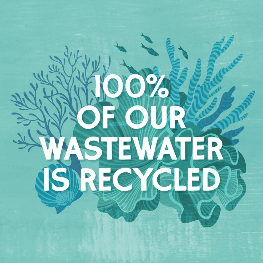
Inspired by the undulating ocean, the custom design layers soft, rounded edges with asymmetric ripples across the surface to create a sense of fluid, natural movement. The bottle uses a high content of recycled glass at 34%. Which is a practical limit to the amount of recycled content that be used in flint glass (clear) to ensure glass integrity.

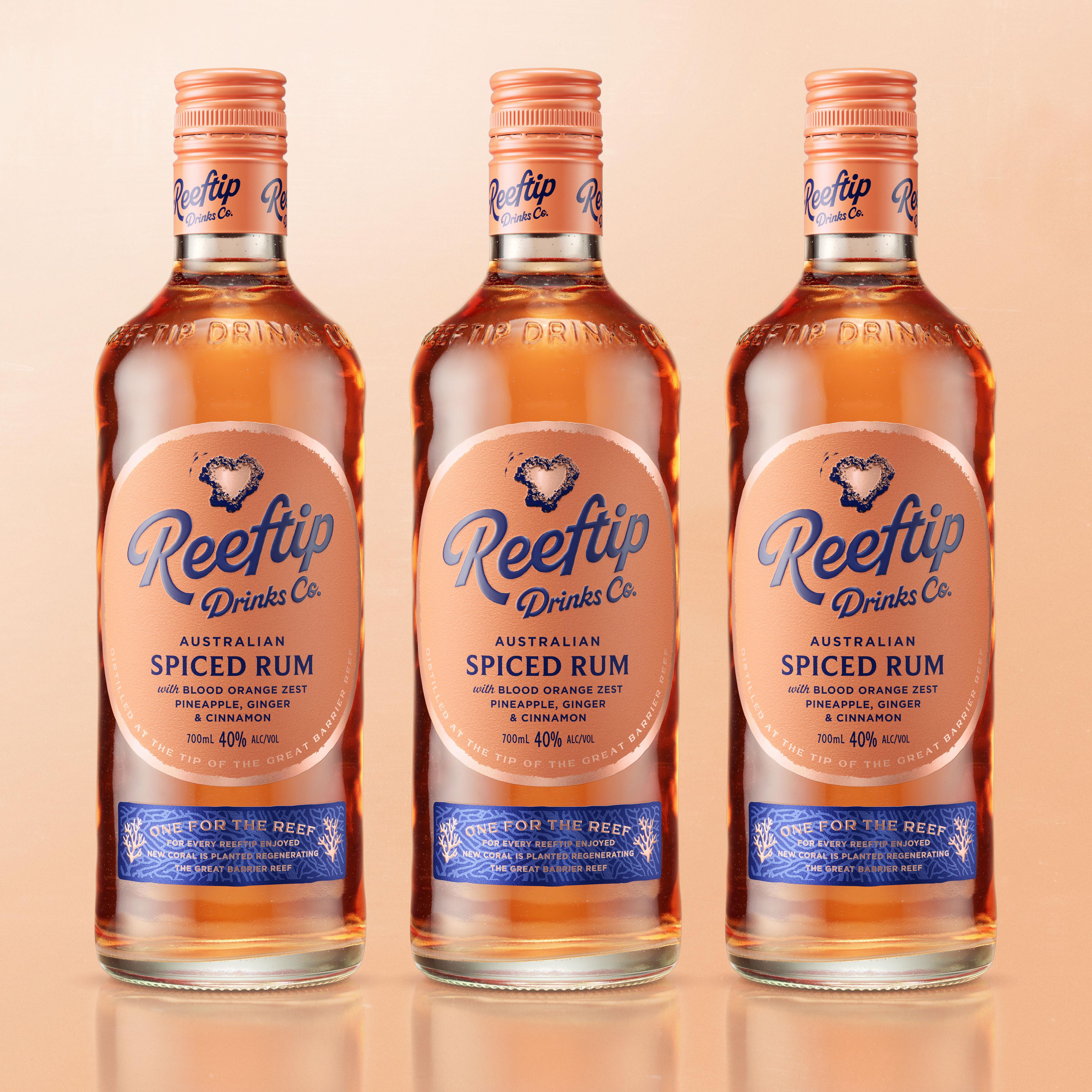


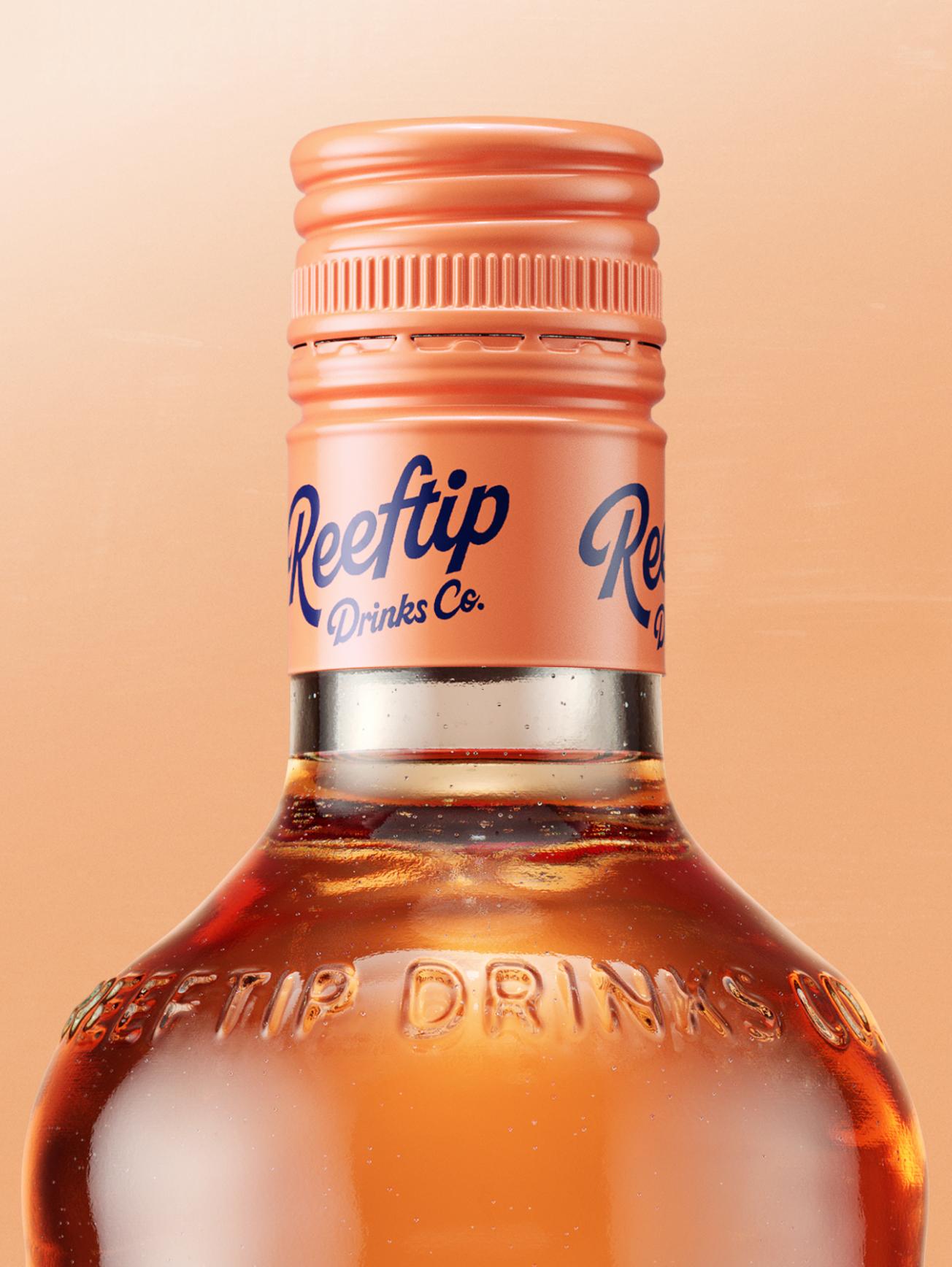
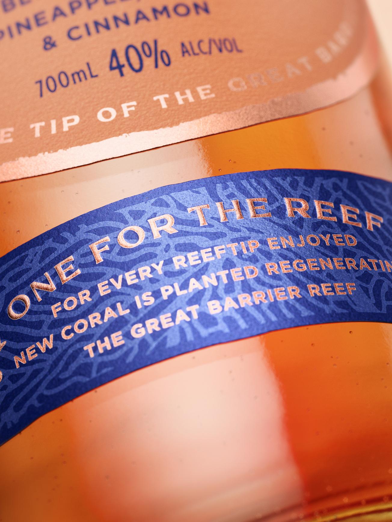
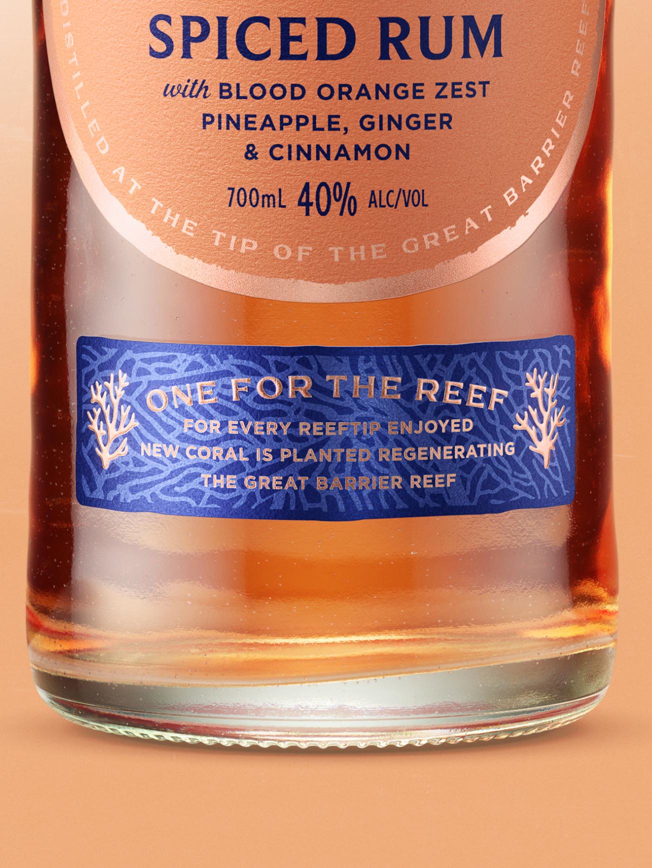
The well-being of the reef inspires every design and production decision. From the bespoke bottle, to the label stock made from recycled sugar cane waste, and, of course, the rum itself, made from distilling molasses, a by-product of sugar production.


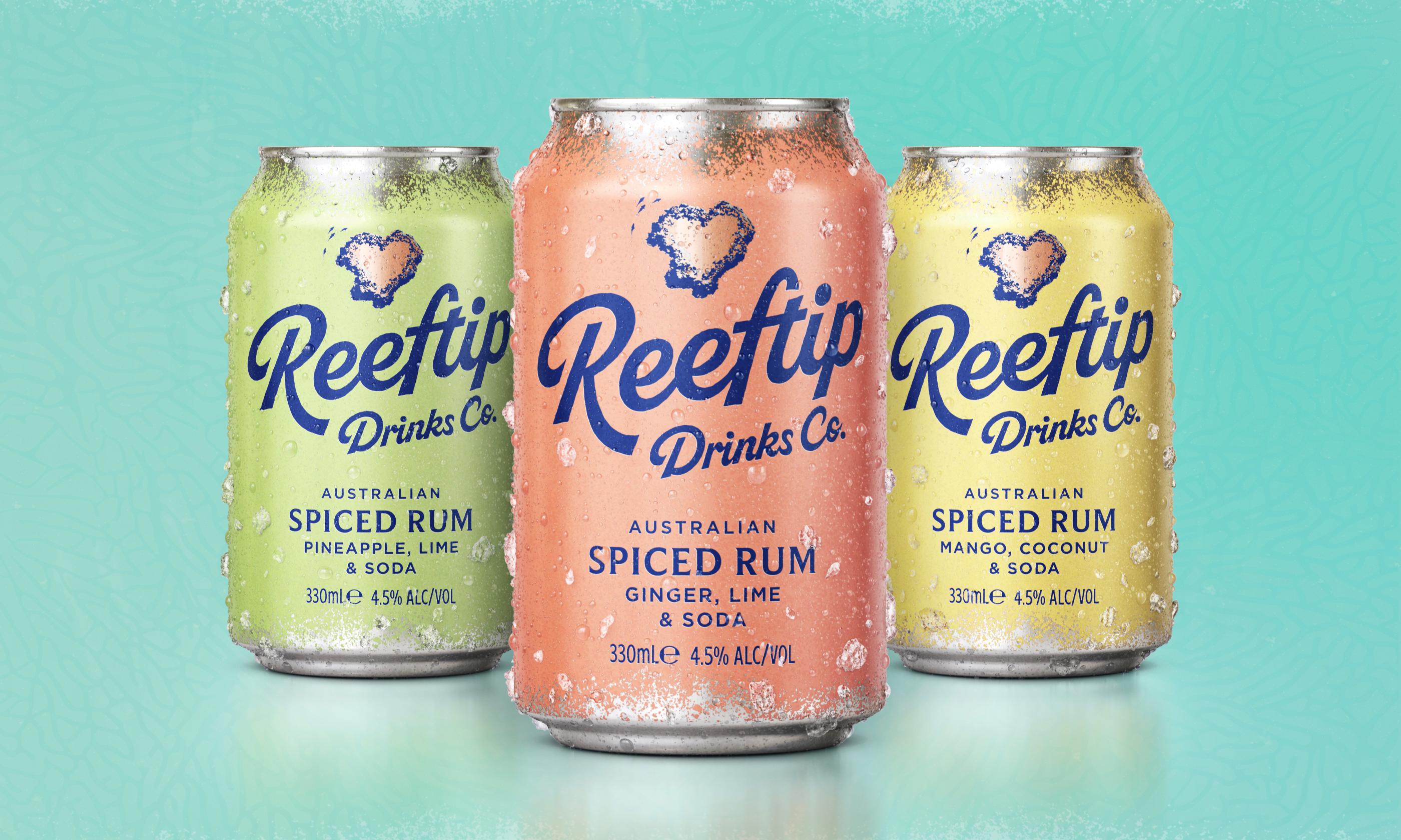
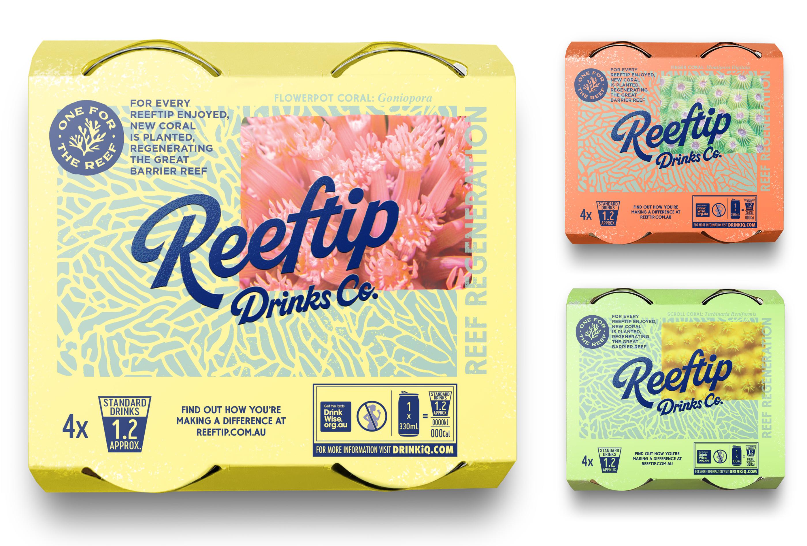
“For every Reeftip enjoyed, new coral is planted, regenerating the Great Barrier Reef.”


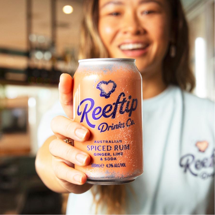
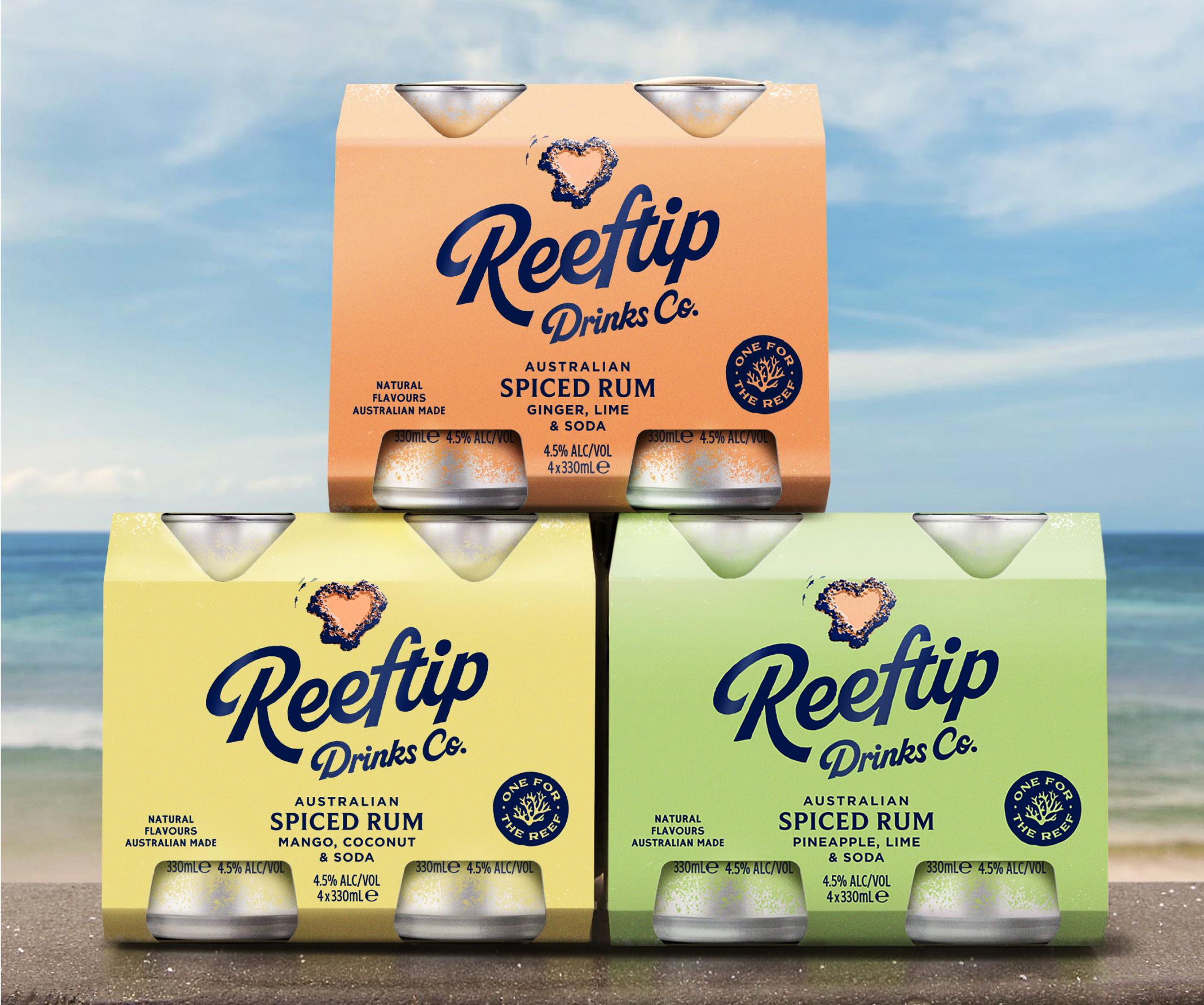
We extended our key brand assets and design principles into a range of delicious ready-to-drink, spiced rums. As aluminium is the most sustainable RTD format, these are packaged in cans. The outer cardboard 4-pack wraps provide further room for storytelling to celebrate some of the stunning corals found on the reef.
Our development of a brand world ensured a consistent message and design aesthetic when launching to market. And as the end product shows, that like the reef itself, the care you put in, brings it to life. Reeftip Drinks Co. is a force for nature that will benefit The Great Barrier Reef for years to come.