A family distillery with
rainforest regeneration at its heart

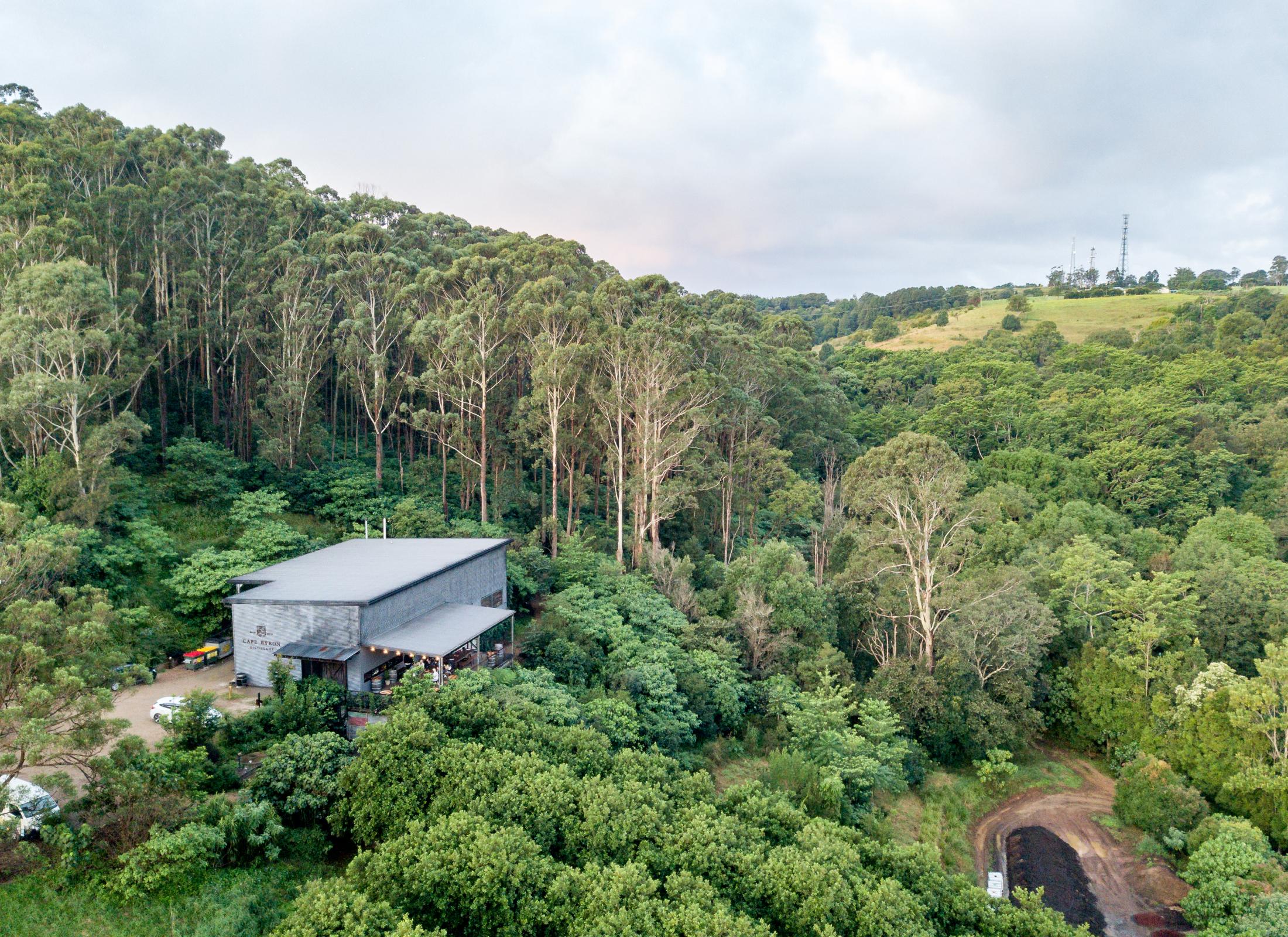

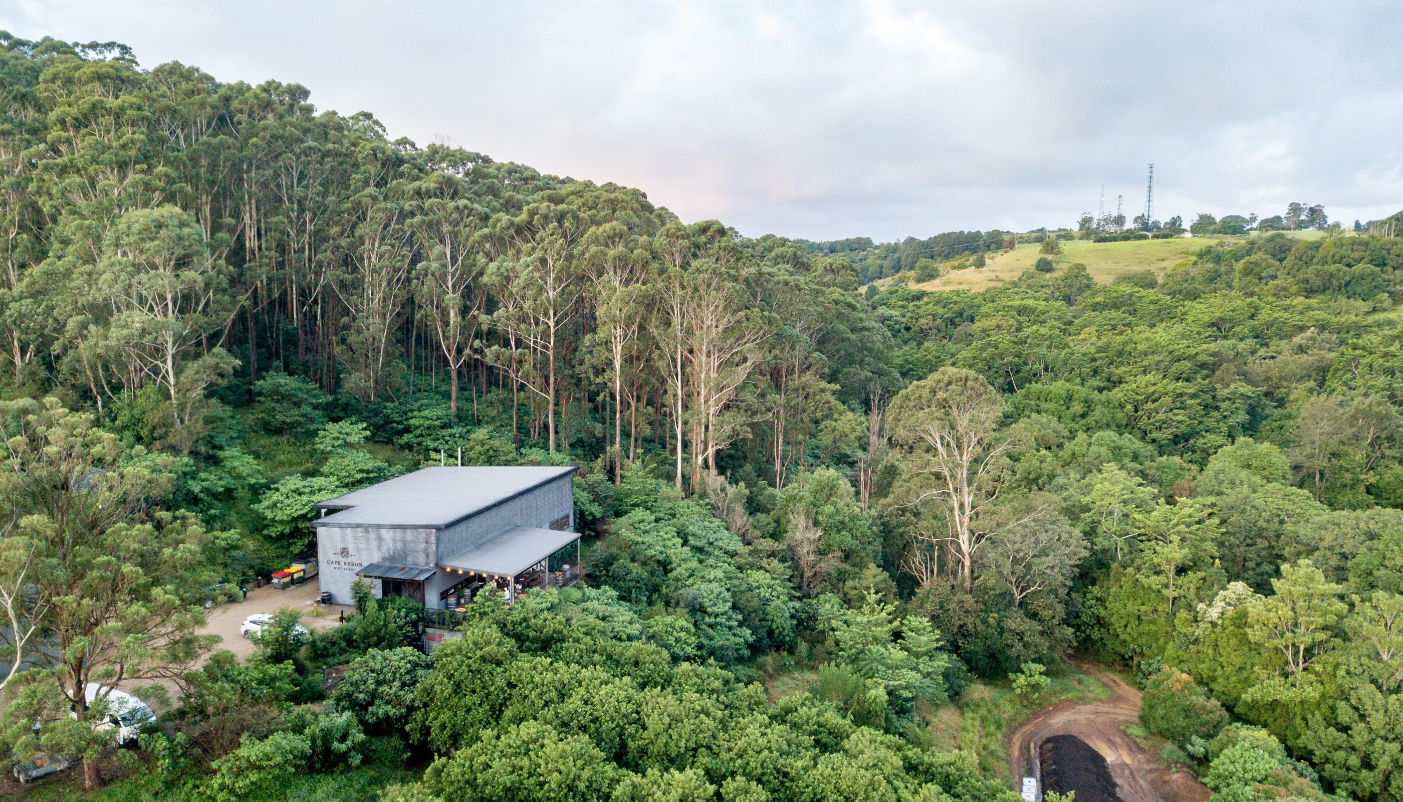
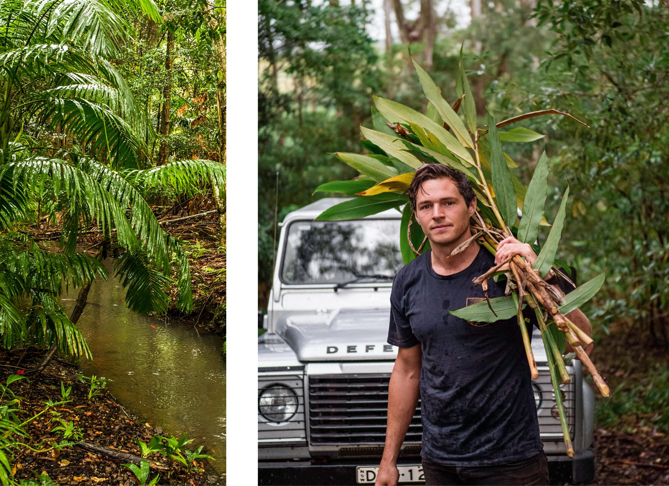
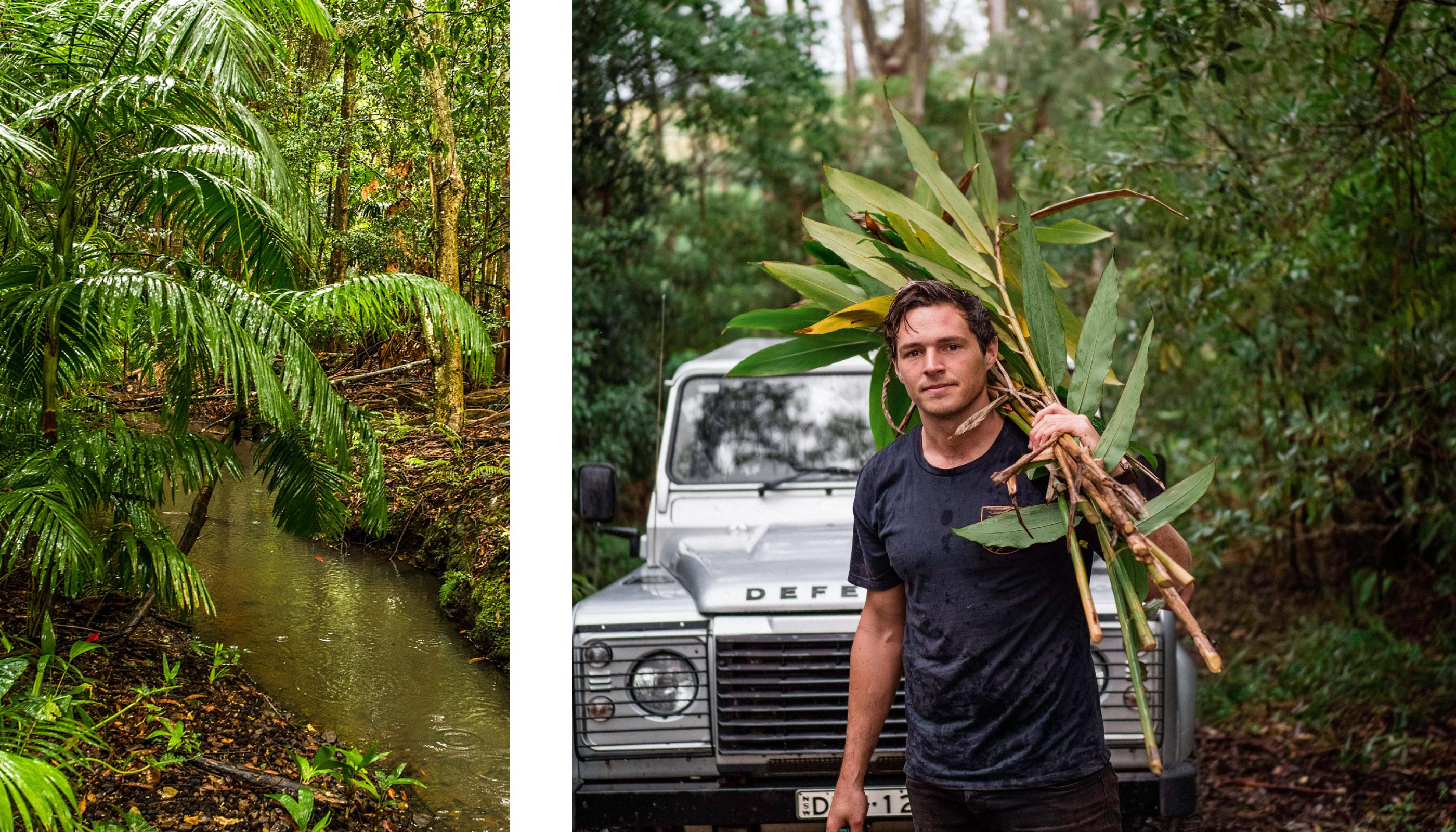
Nestled amongst the rainforest of Byron Bay’s hinterland is the home of Brookie’s Gin. The Brook family purchased the property in 1988, at a time when it was completely neglected and barren. They have worked for over three decades to restore the landscape into a lush, native rainforest ecosystem alongside rows of macadamia trees. It’s now a haven for wildlife and abundant with native Australian botanicals. In 2022, they gained B-corp certification in recognition of their passion to do good in the world and in business.
Gin with an Australian native twist
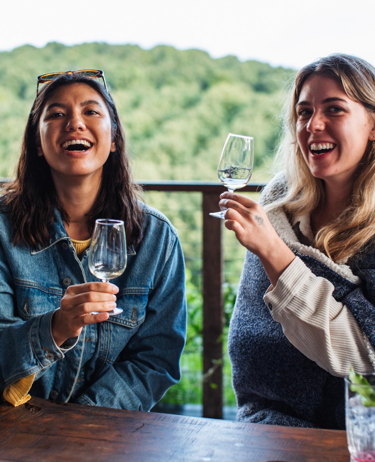
Co‑Partnership first partnered with Brookie’s in 2016. Our first brief was to build a gin brand that established their unique position in the category. We started by visiting the Brooks on their farm to fully experience and understand their story. Taking us on a tour of their lush rainforest to forage for native botanicals and learn about their regeneration projects. It was a fruitful immersion that seeded the brand positioning ‘It’s in our nature’. That creative anchor informed all design decisions and is used as a consumer-facing tagline for the brand today.
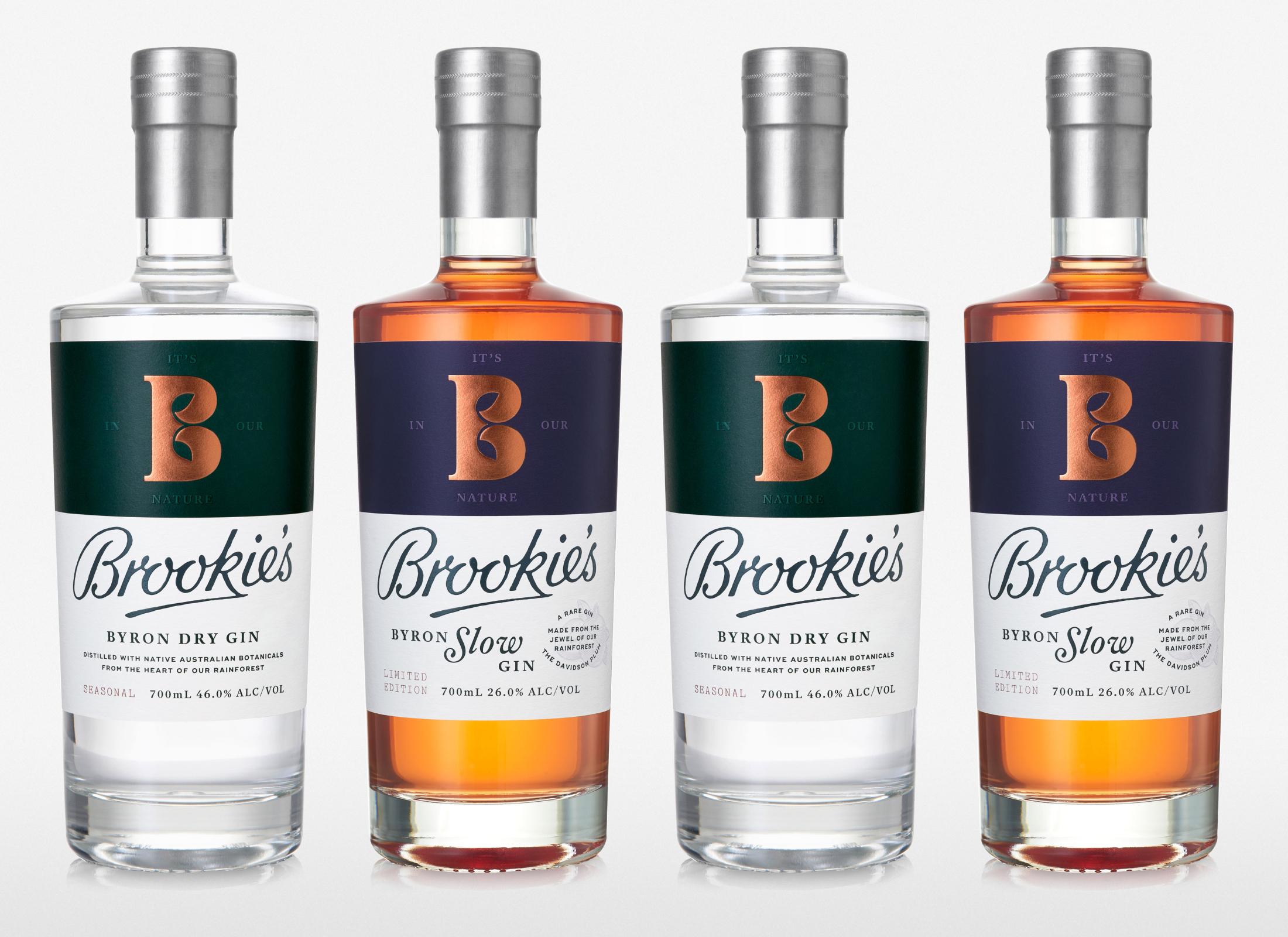
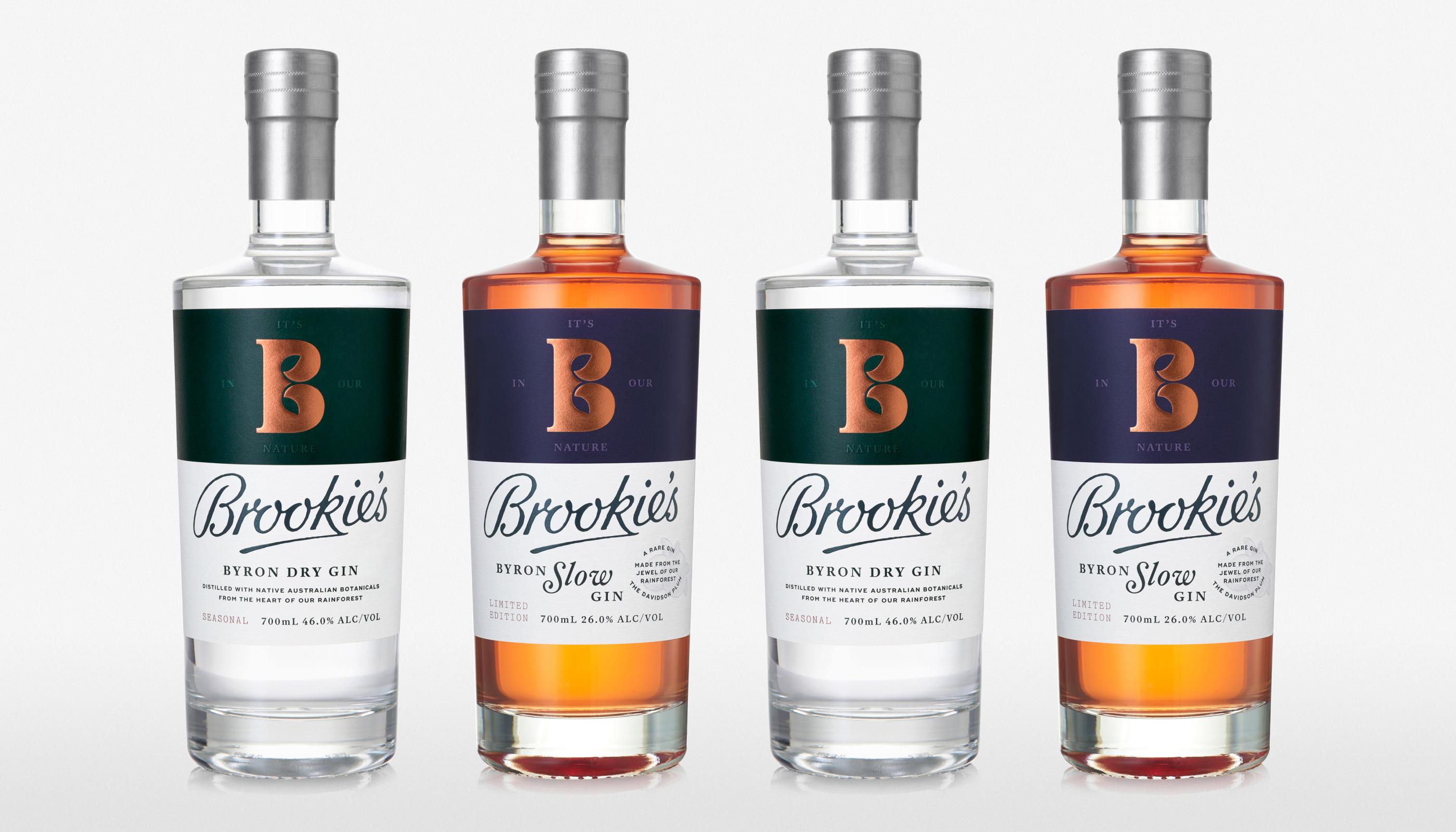

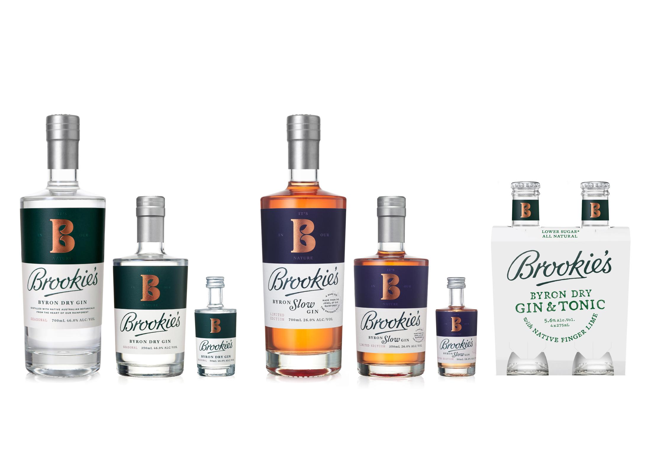
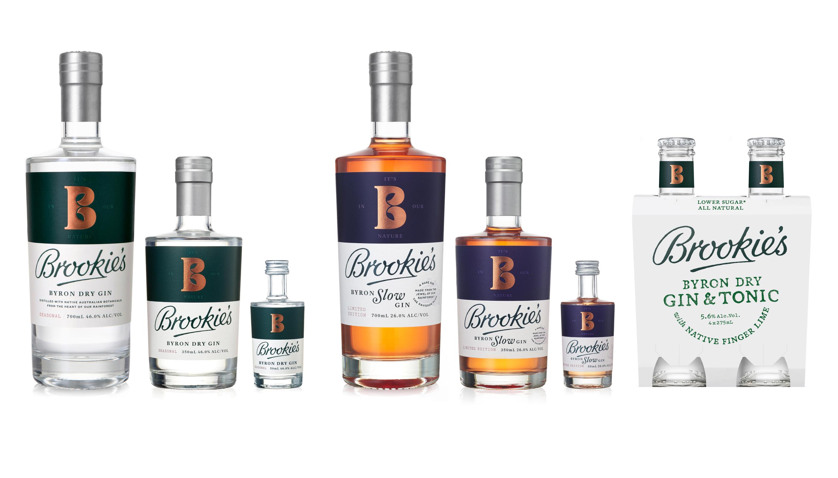
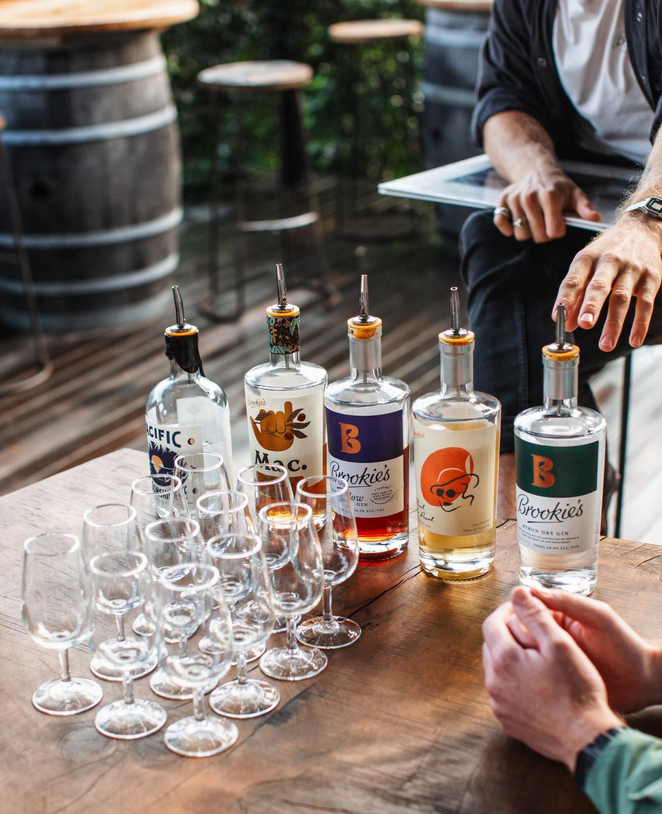
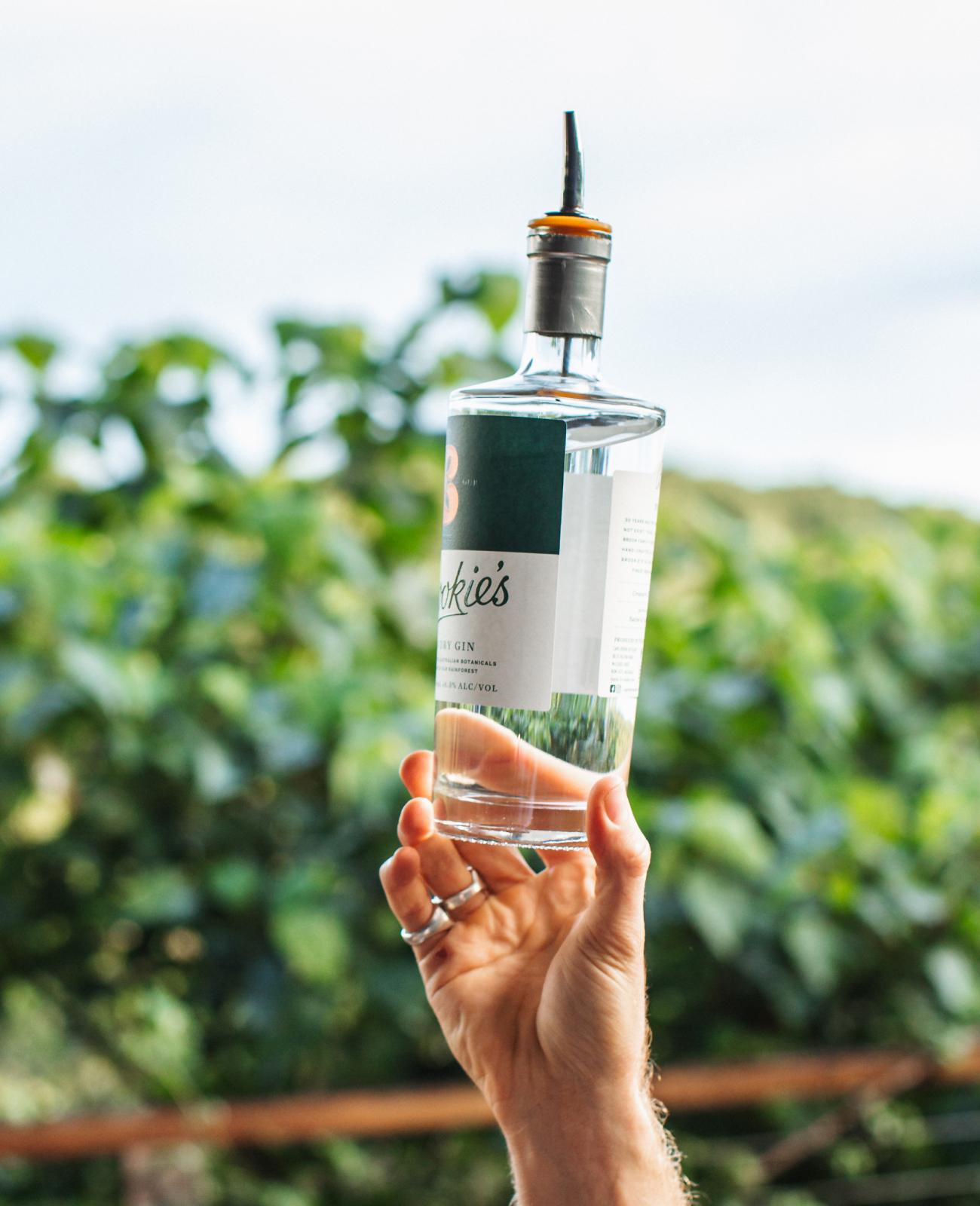
Byron Dry and Byron Slow were the first two gins off the bottling line. In creating their branding and packaging, it was important to position Brookie’s as an Australian classic with mainstream craft appeal. Born in the Byron hinterland, made by a family with environmental care in their nature, this is a premium gin with an ambition to be accesible to everyone.
Every element has been crafted to capture the Brook family’s passionate commitment to sustainability and embody the Cape Byron Distillery experience.
We visited the farm and spent time foraging for native botanicals with the Brook family to learn about their process and passion.
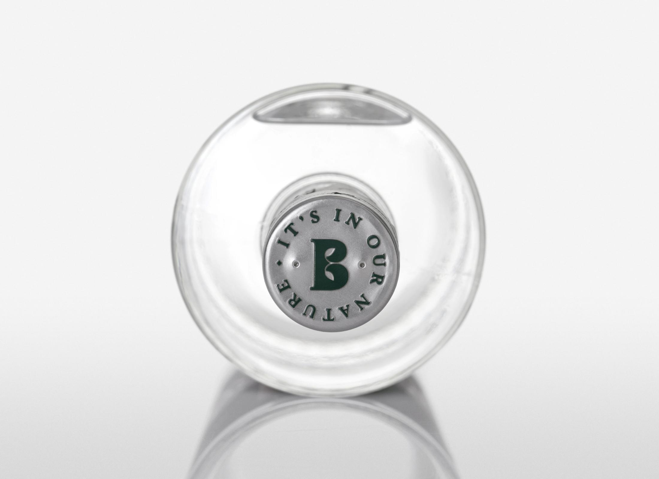
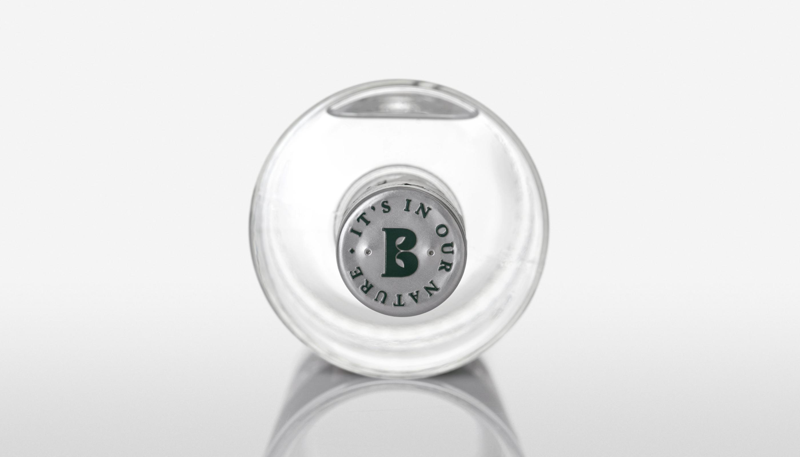
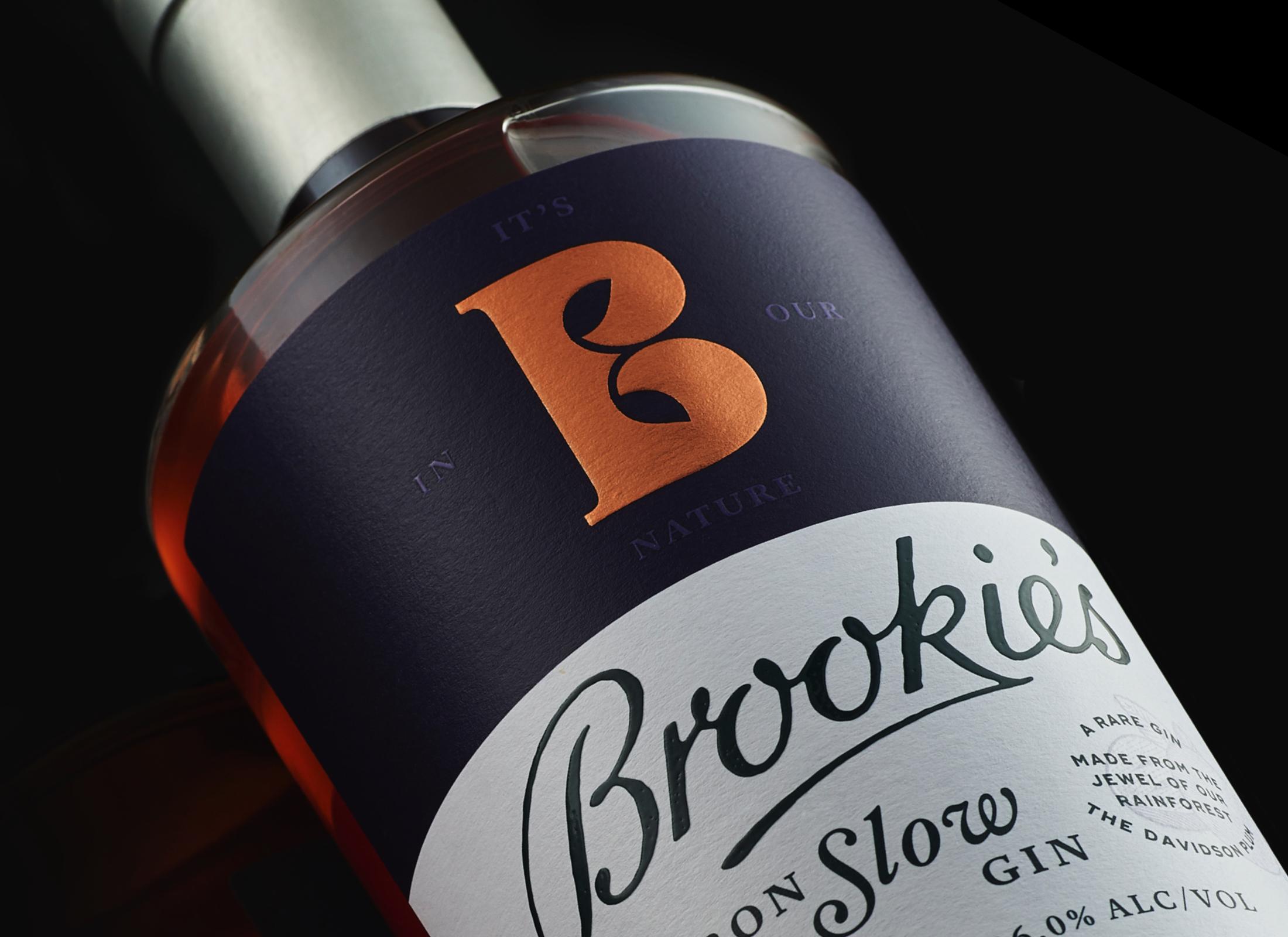
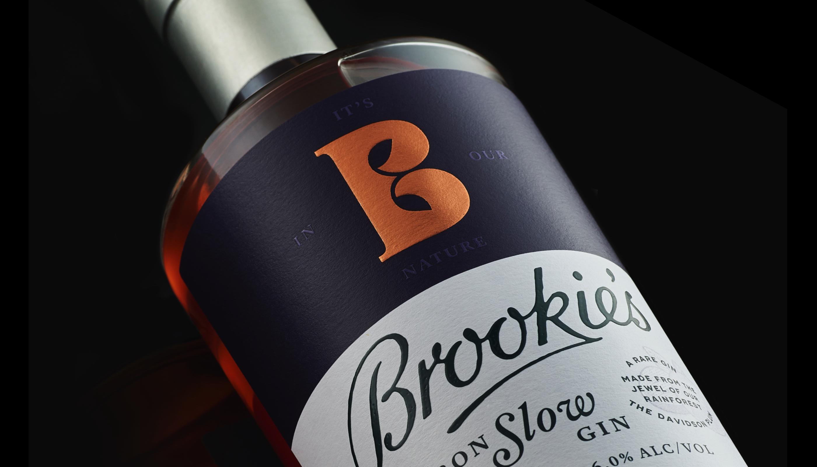
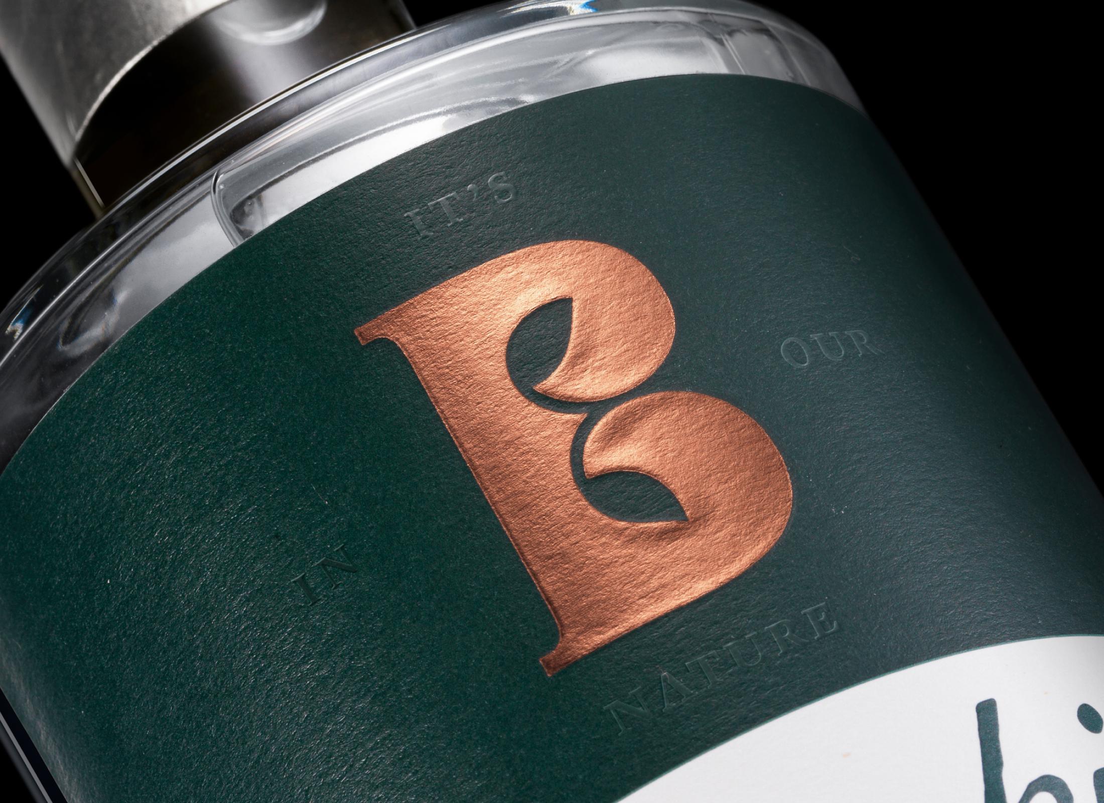
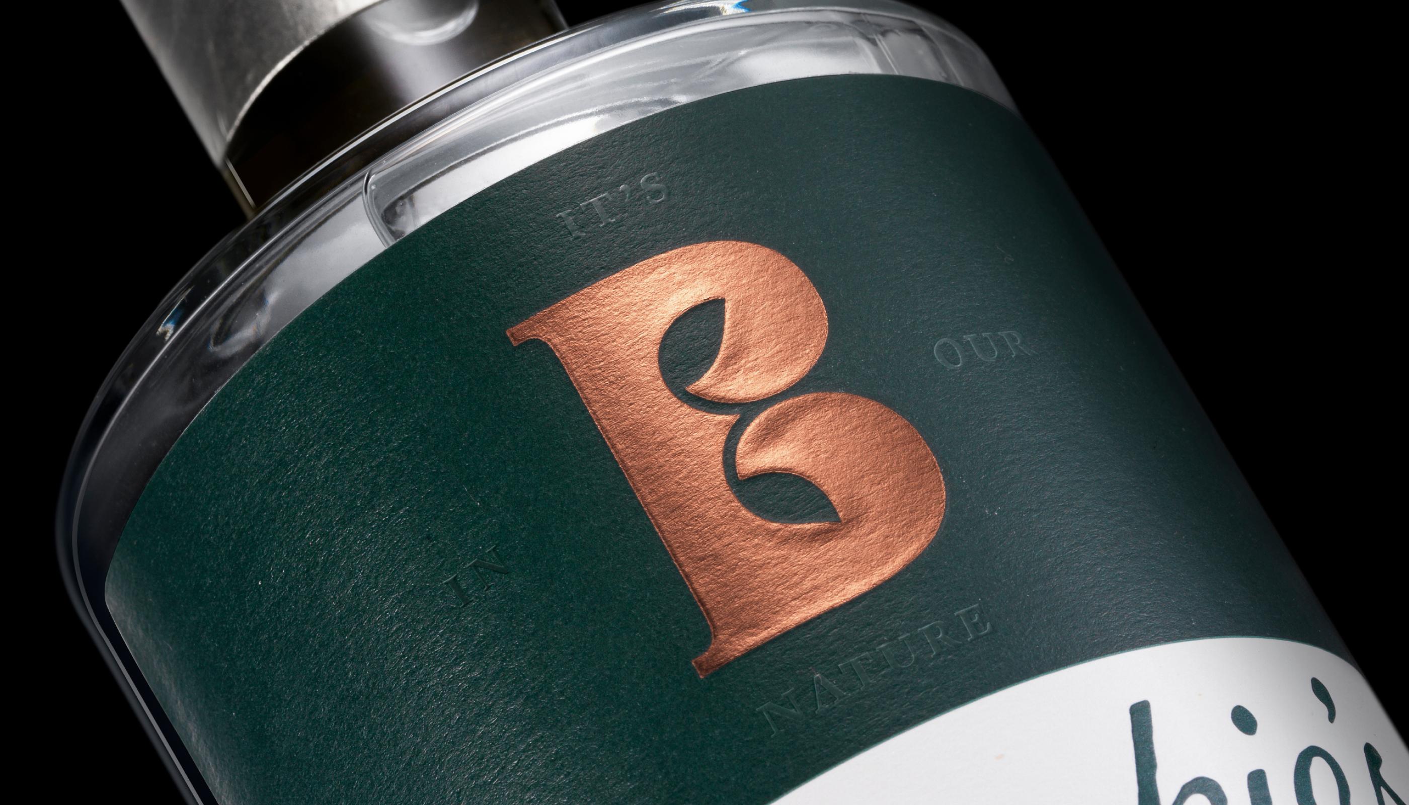
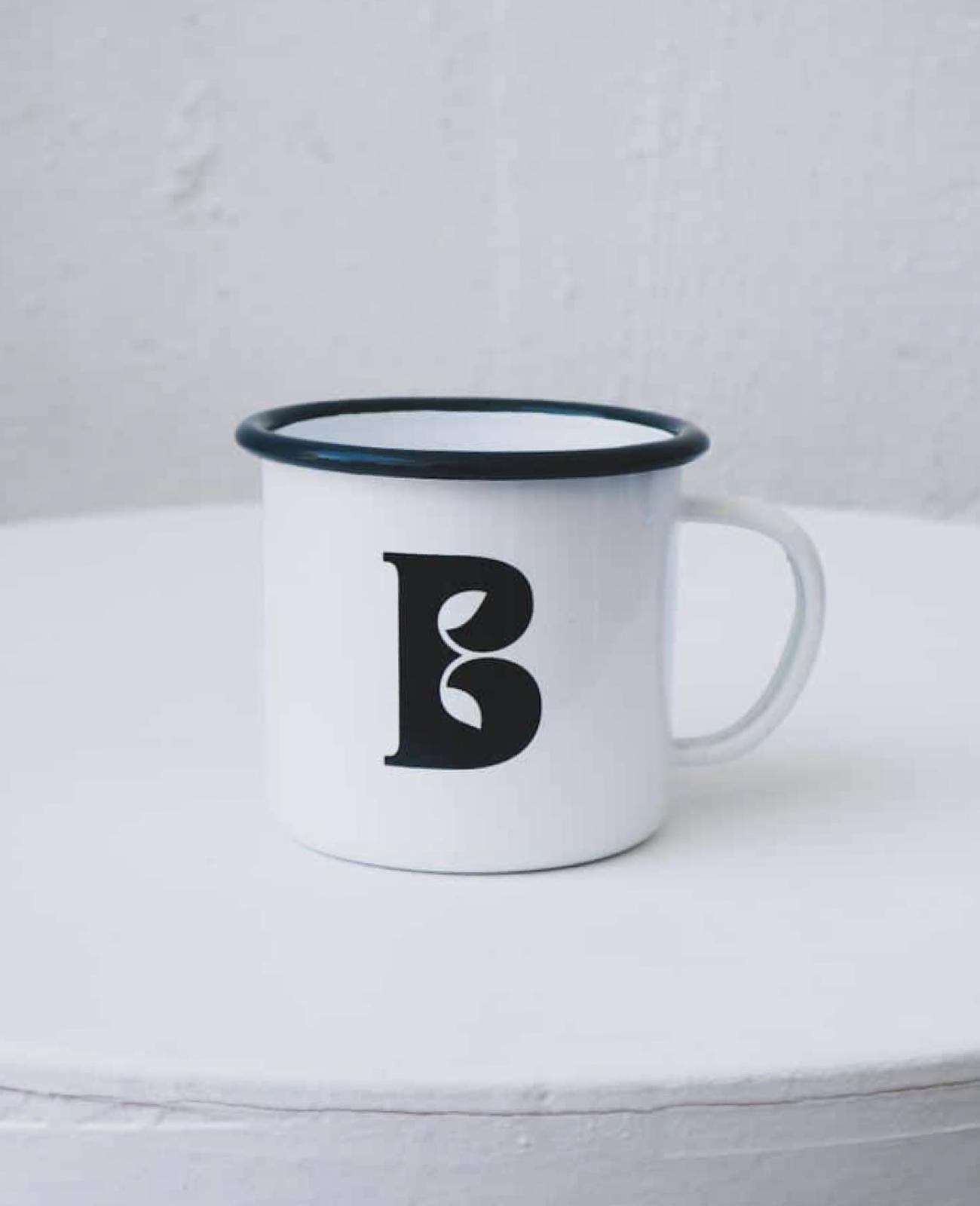
The ‘B’ brandmark was inspired by their gin still that sits in the centre of the rainforest. Two curling leaves embossed in copper foil represent the still and botanicals coming together, while the surrounding emerald green references the deep green colour of the rainforest.
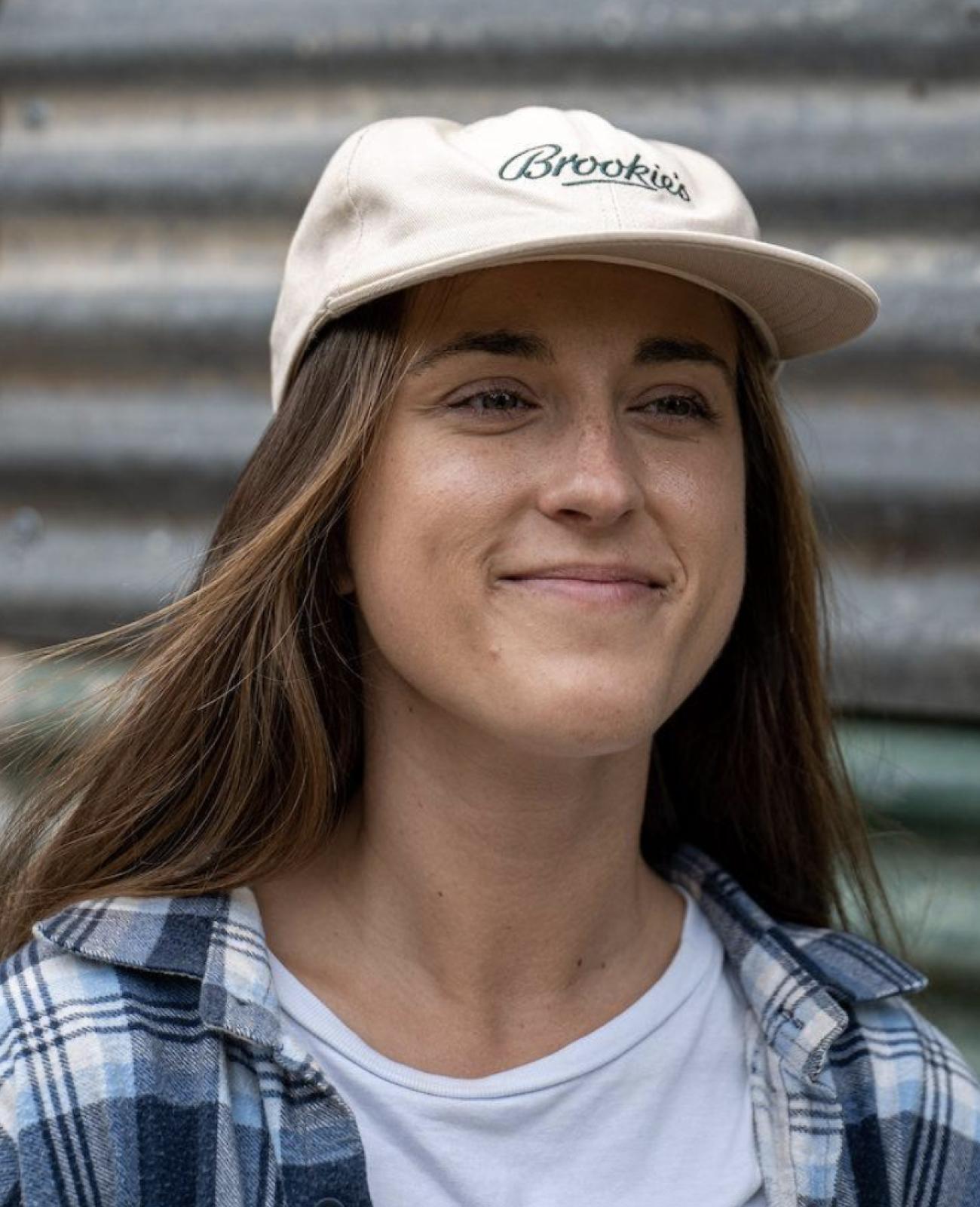
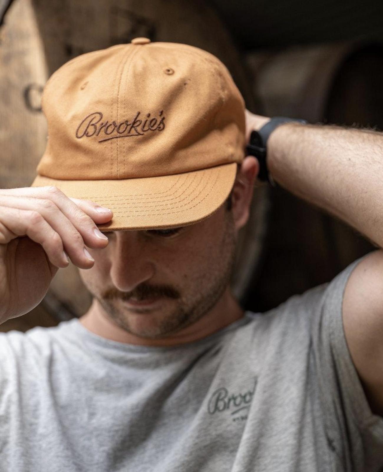
The Brookie’s wordmark is hand-lettered to be reminiscent of a family signature. Retaining natural imperfections for a personal touch, it captures the timeless spirit of an established family brand.
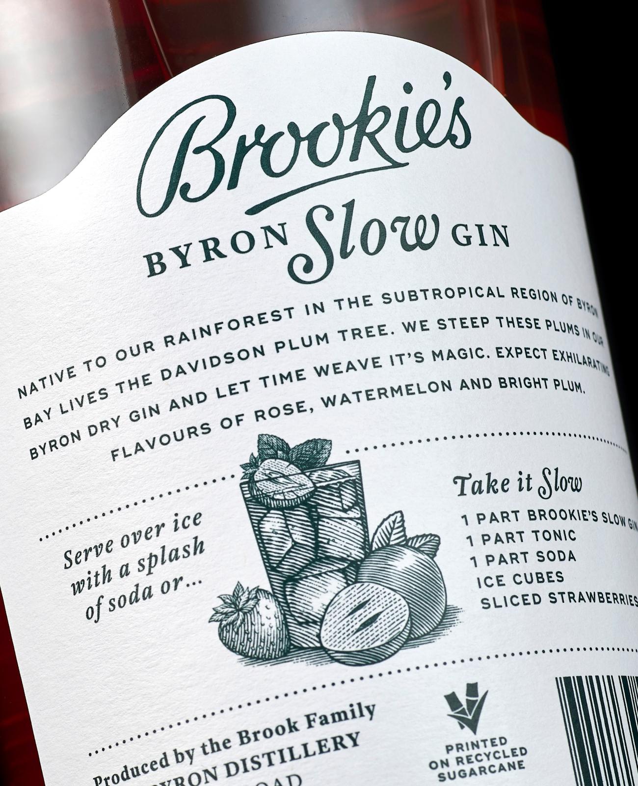
The label is printed on recycled sugarcane paper selected for its environmental credentials.


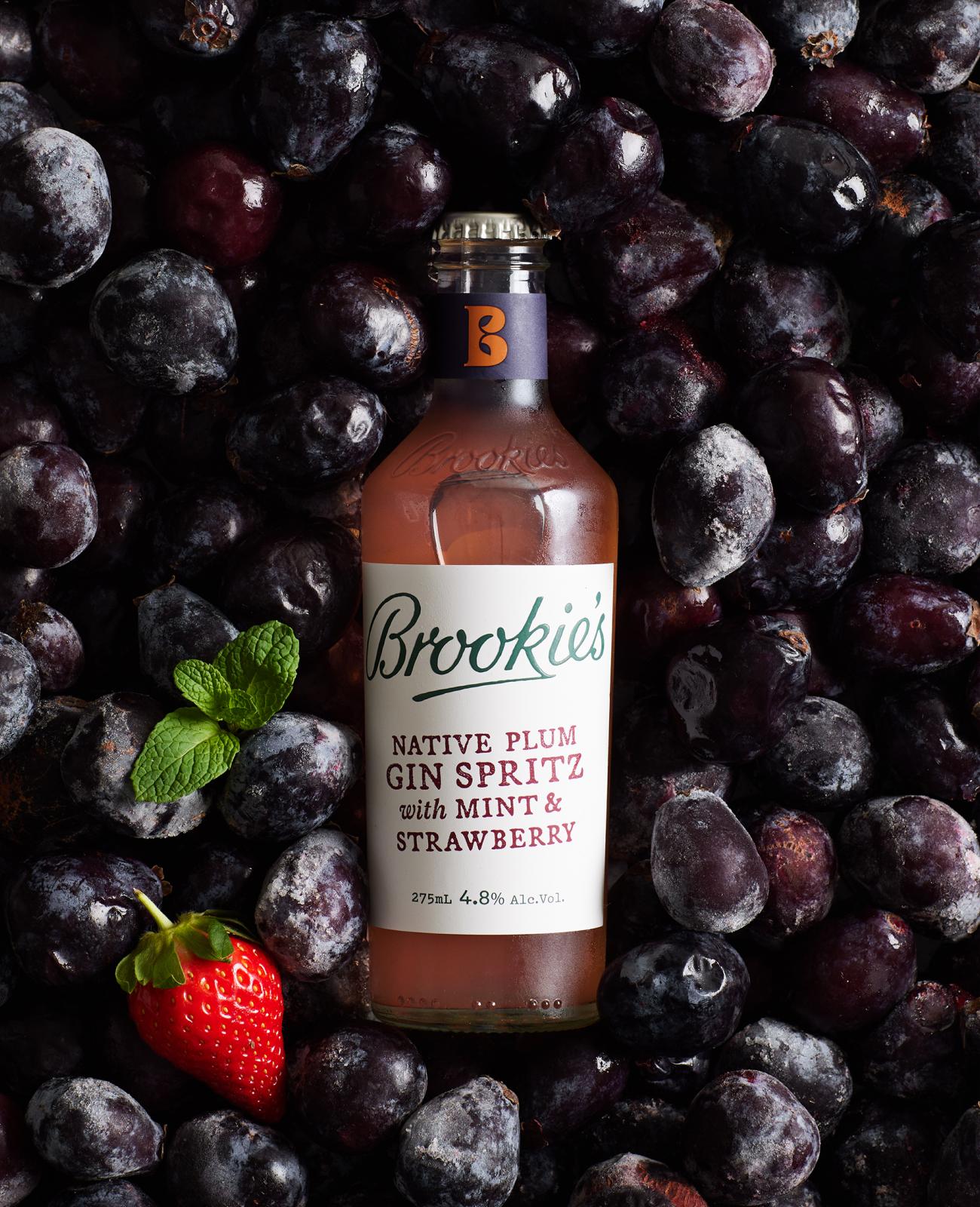
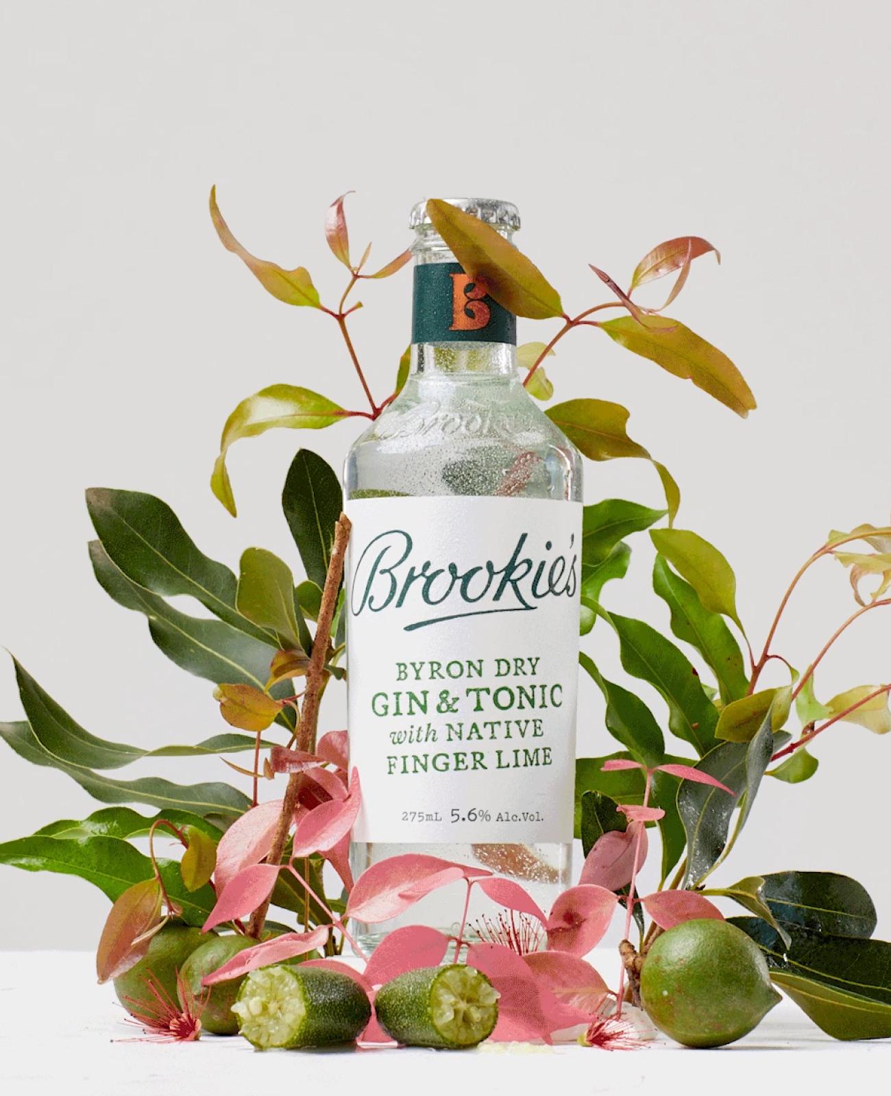
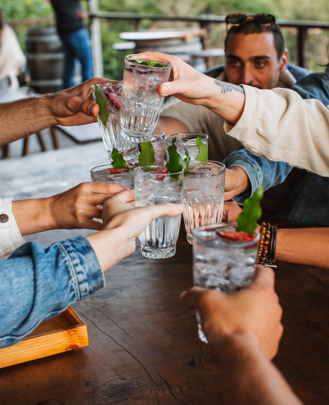
Since launching, the Brookie’s brand has experienced rapid growth and can now be found in bars and bottle shops throughout Australia and internationally. Off the back of this success, the brand has continued to expand with limited editions, nut liqueurs and a range of RTDs.
Following the success of the gins and seeing an opportunity
in the growing ‘ready-to-drink’ category, we partnered with Brookie’s to launch a range of naturally delicious RTDs.
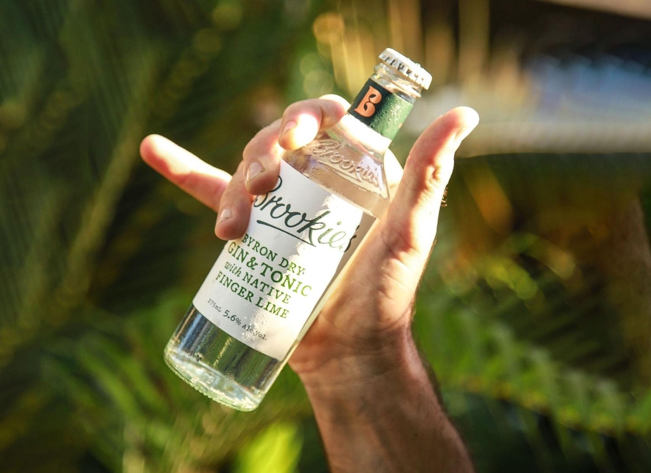
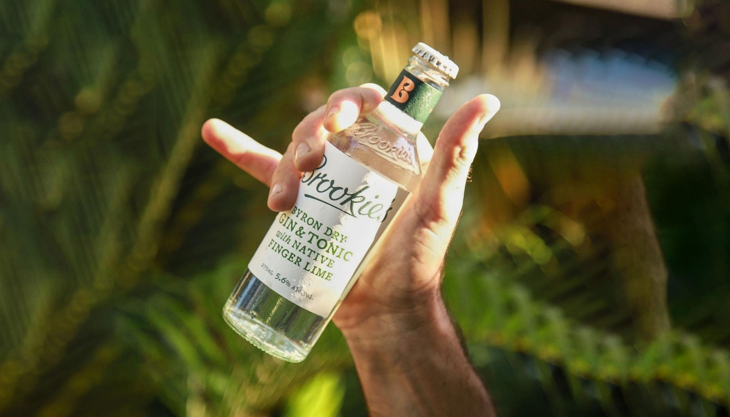


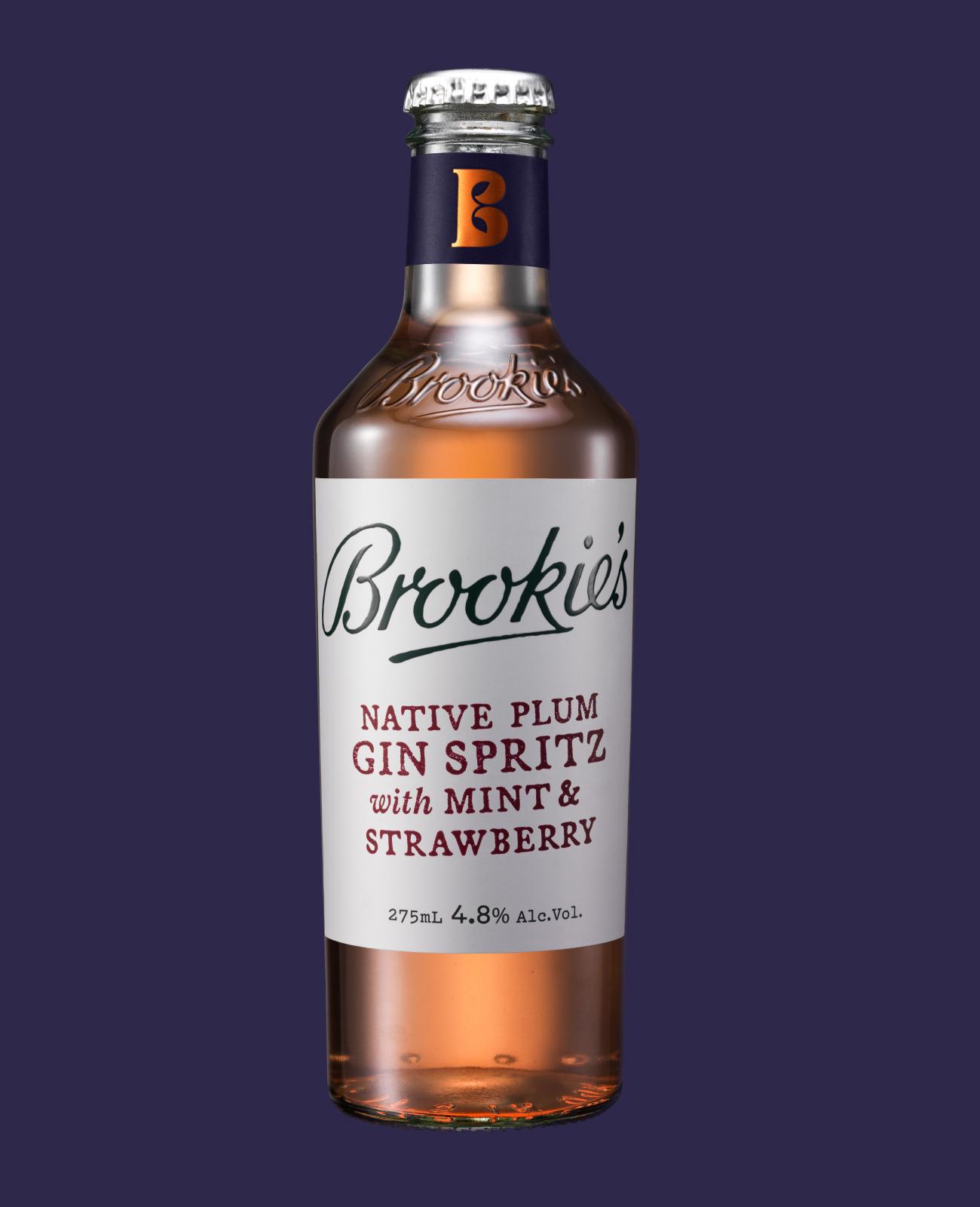
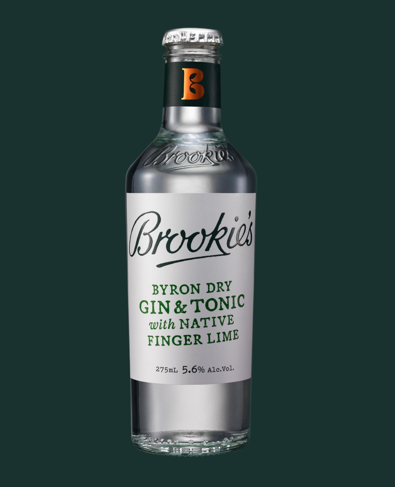
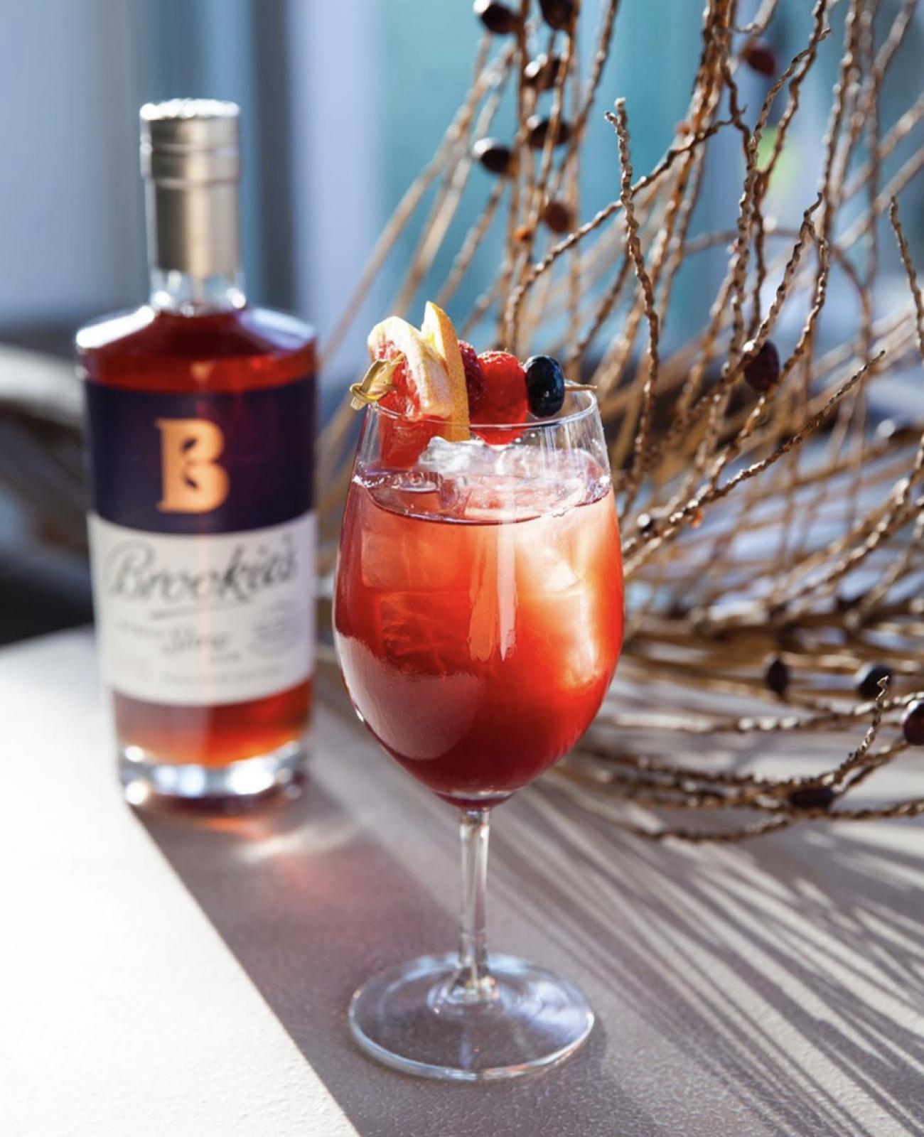
Our ambition with the Brookie’s RTDs was to retain the brand’s mainstream craft appeal but in a more informal expression for casual RTD occasions. We adapted the full stength gin’s tapered bottle structure to a convenient 275mL format and used a market-inspired stamp effect for the product names.