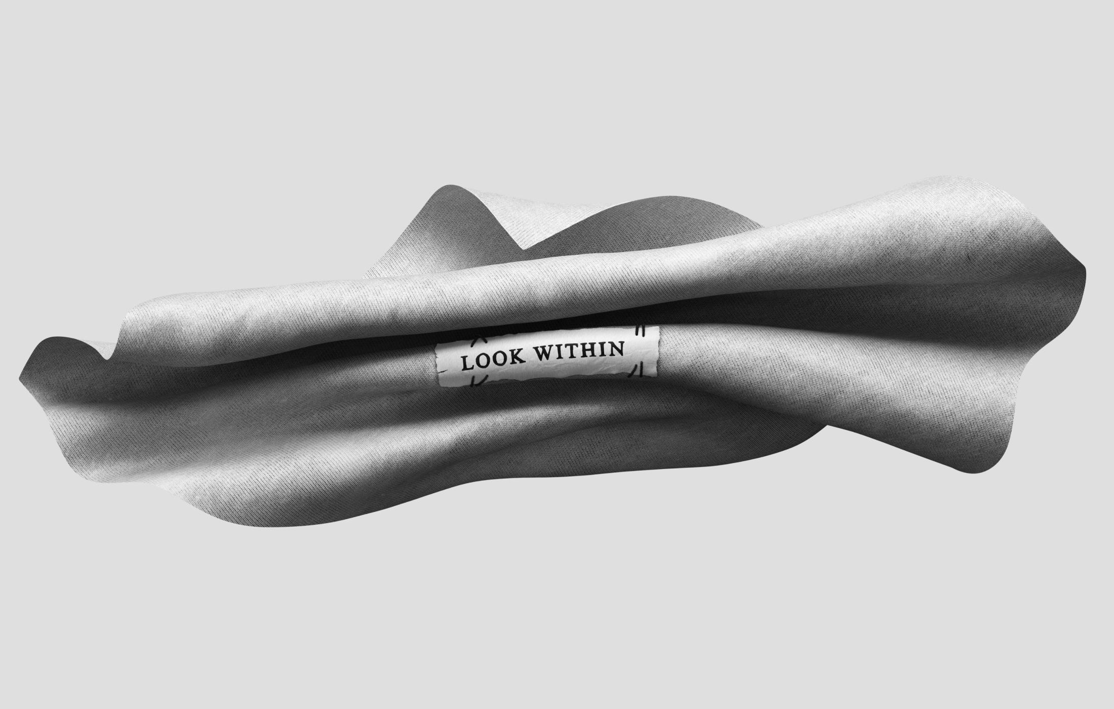
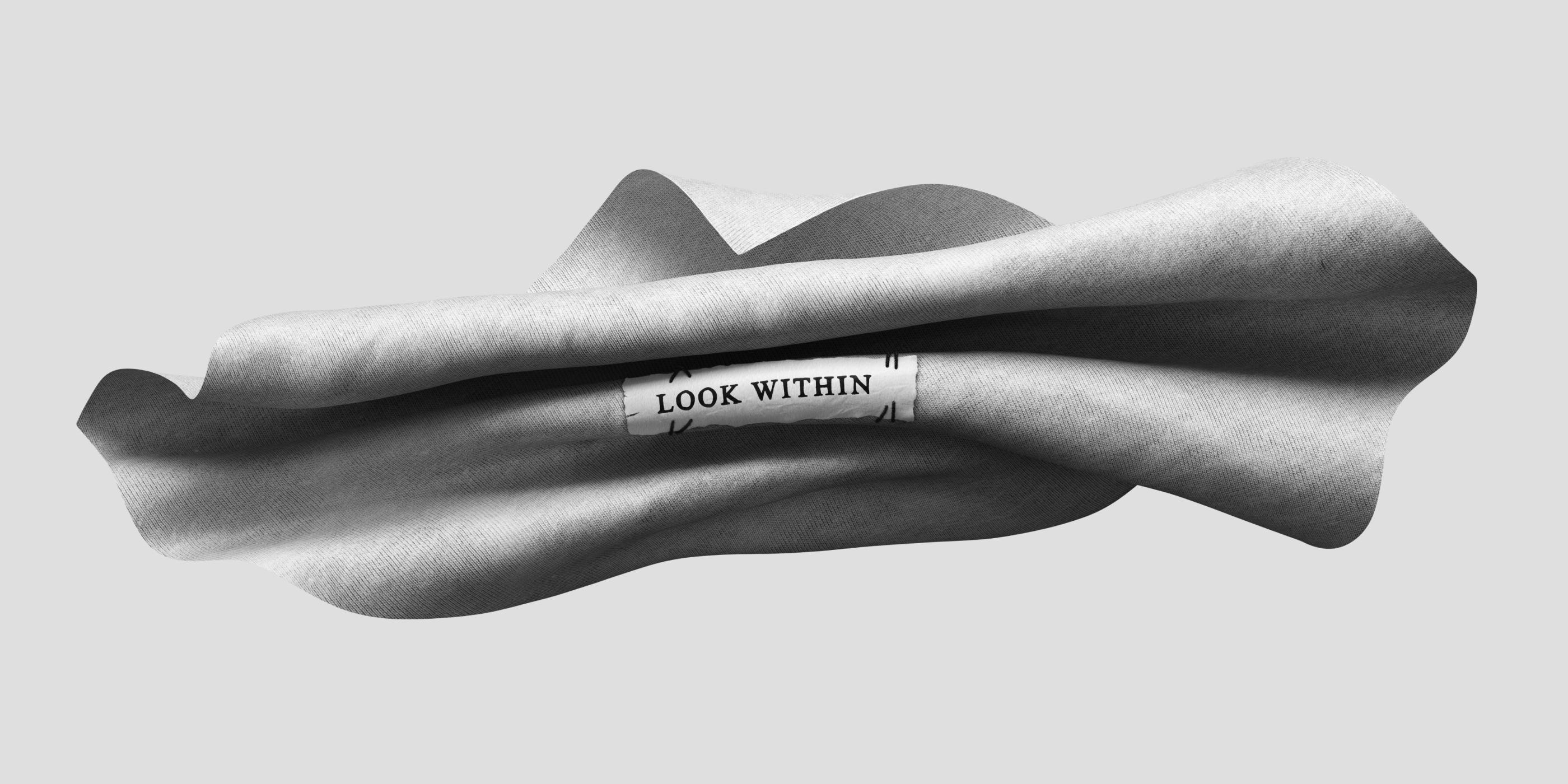
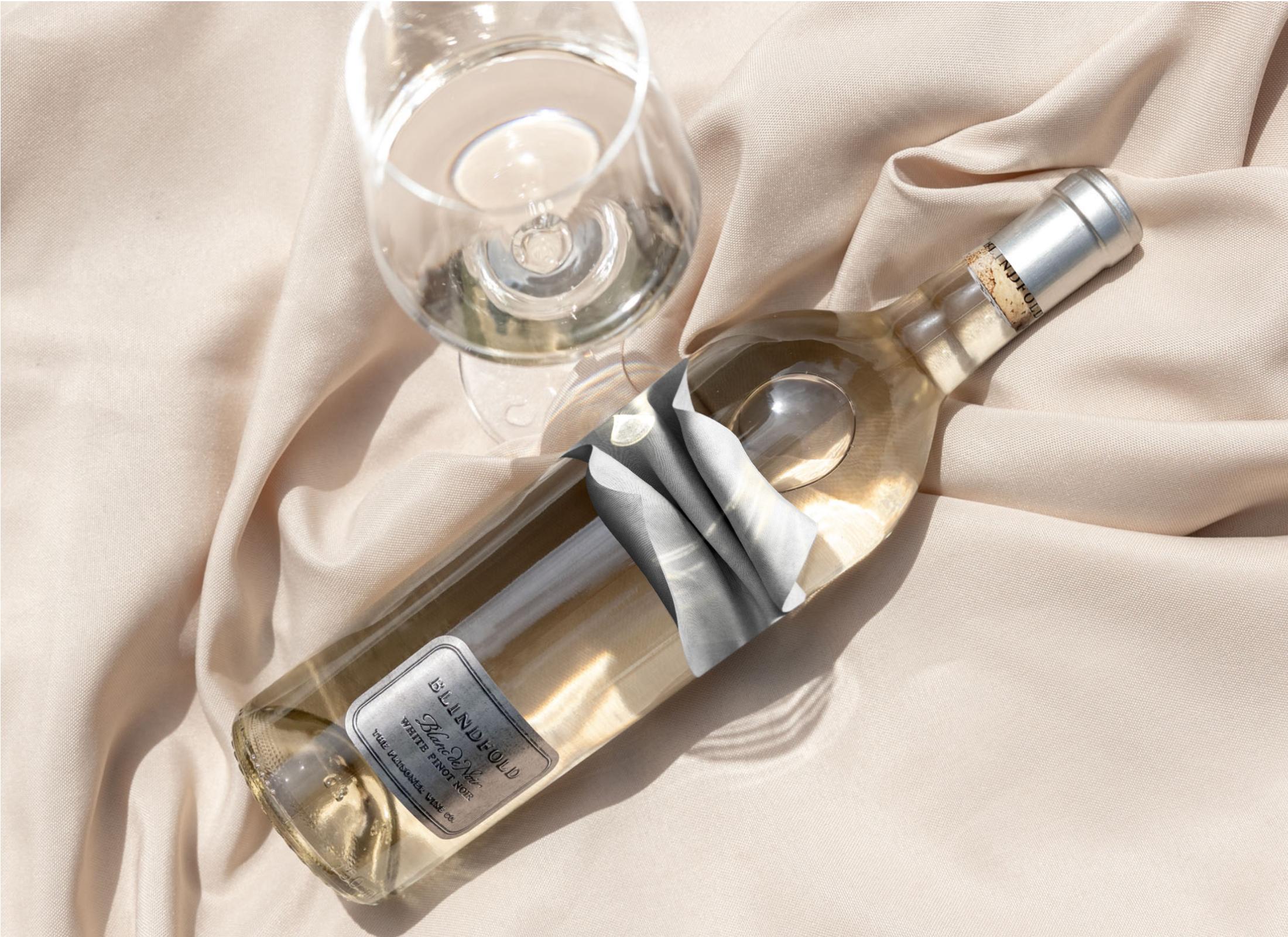
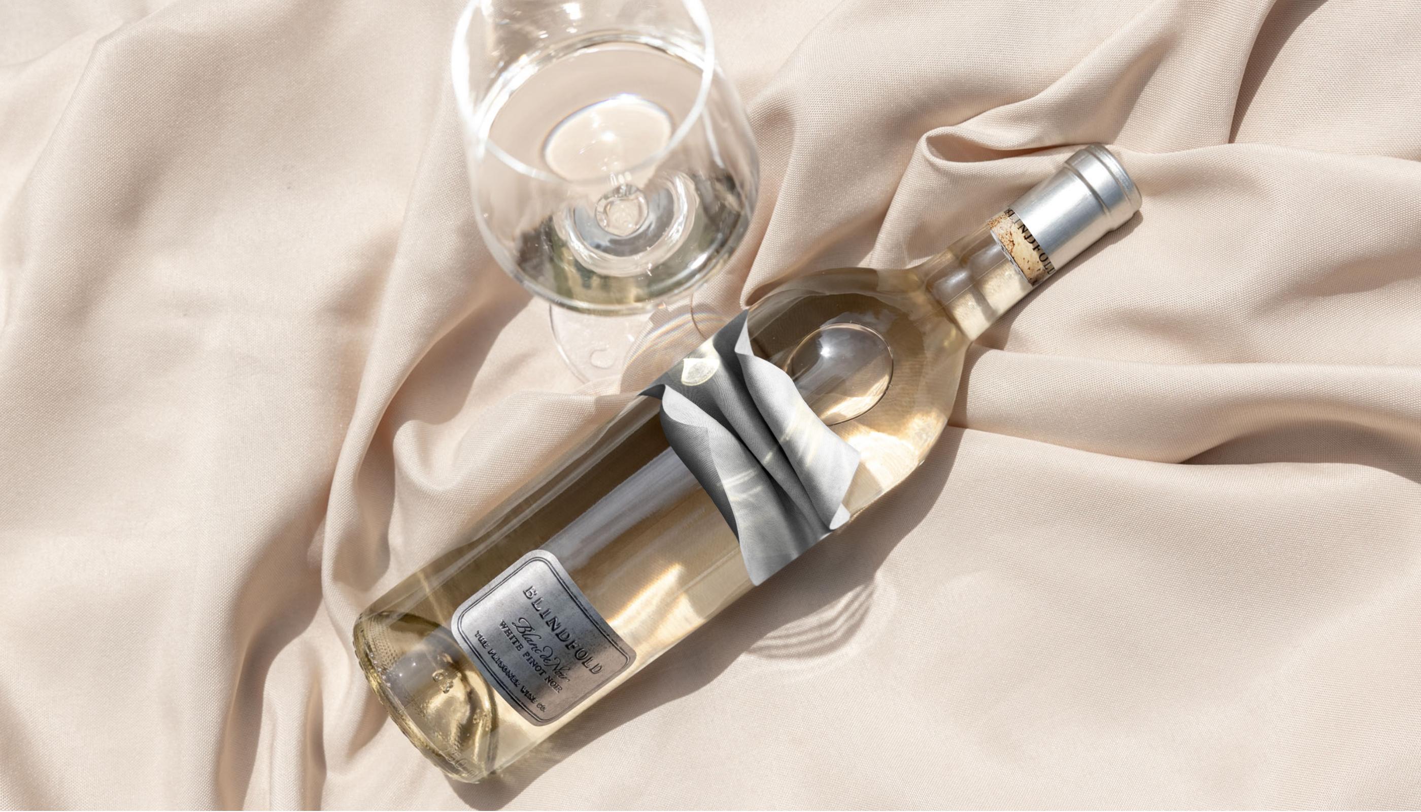
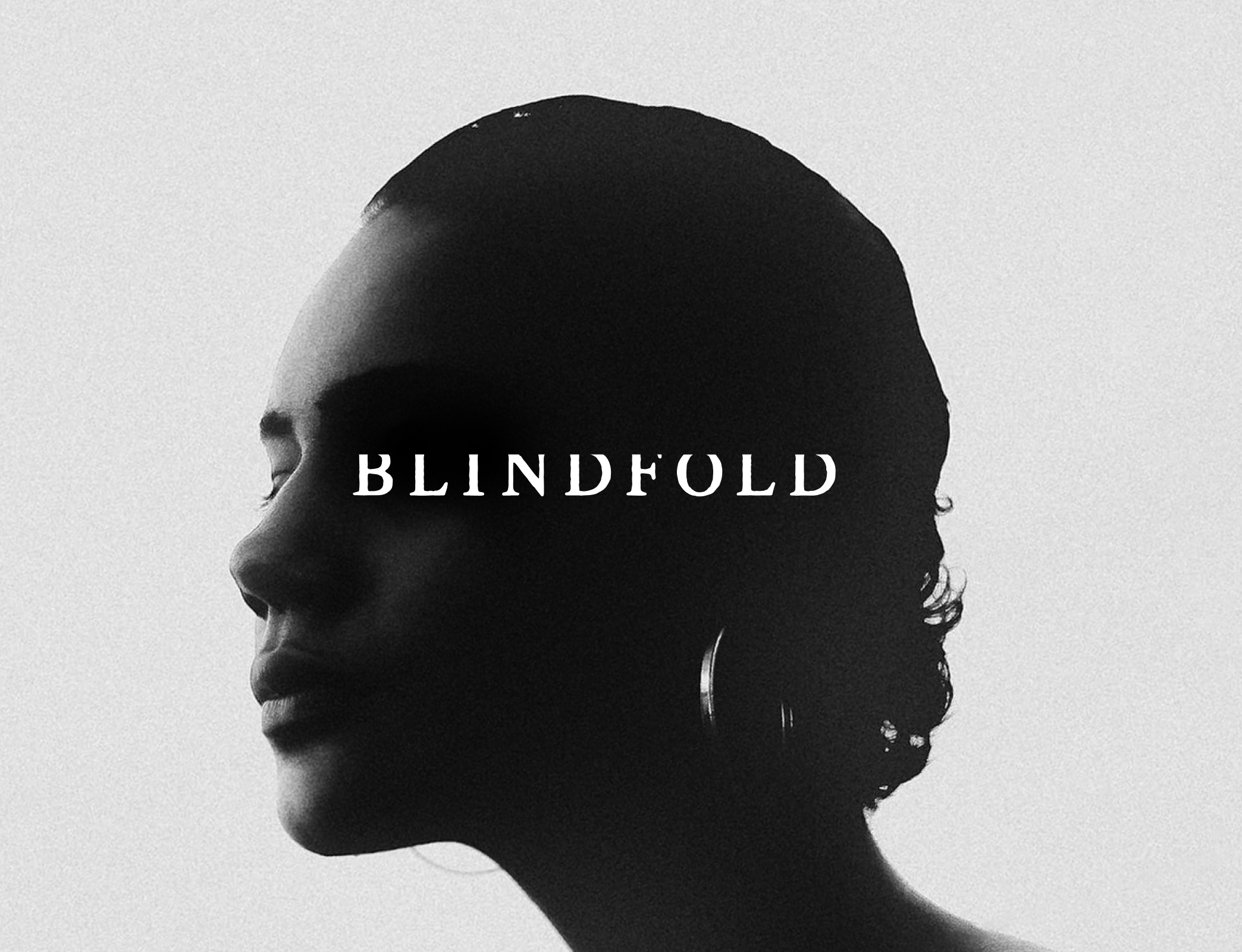
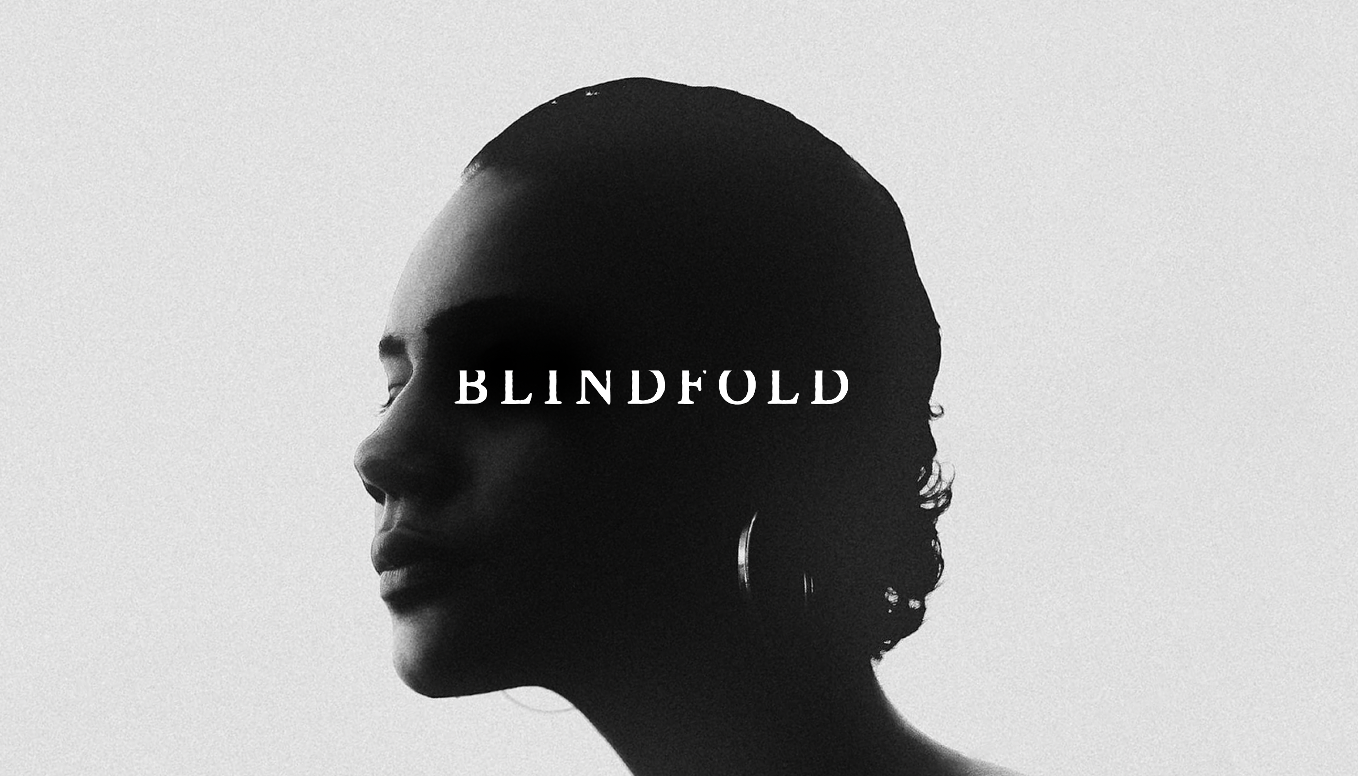
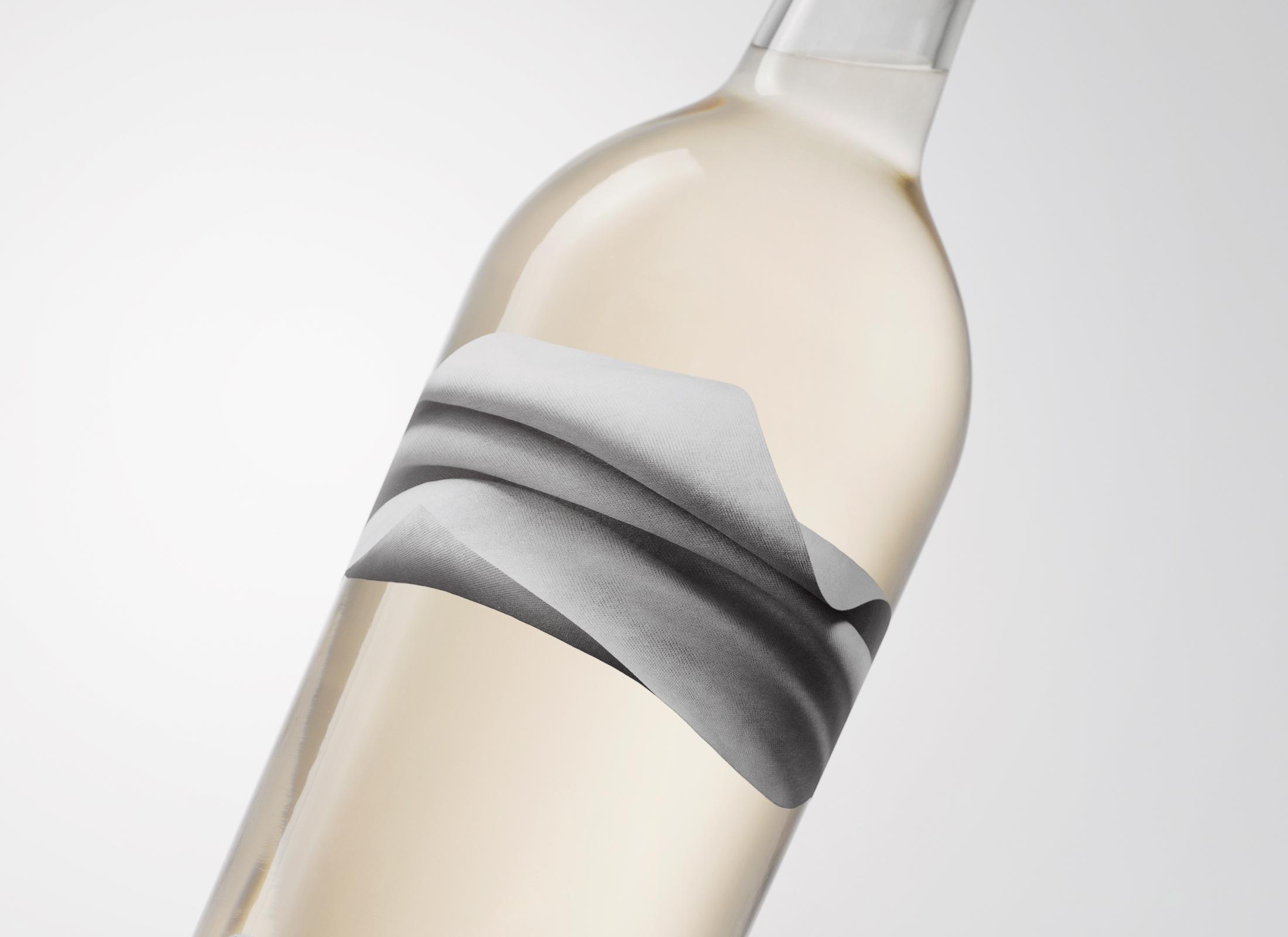
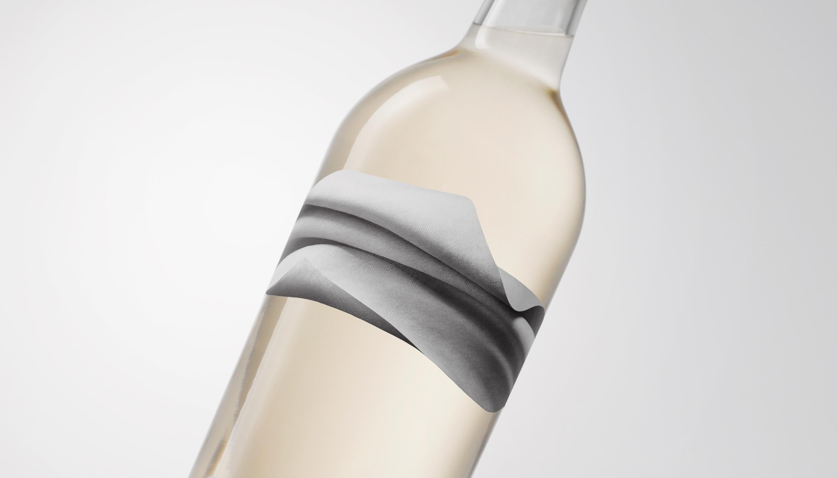
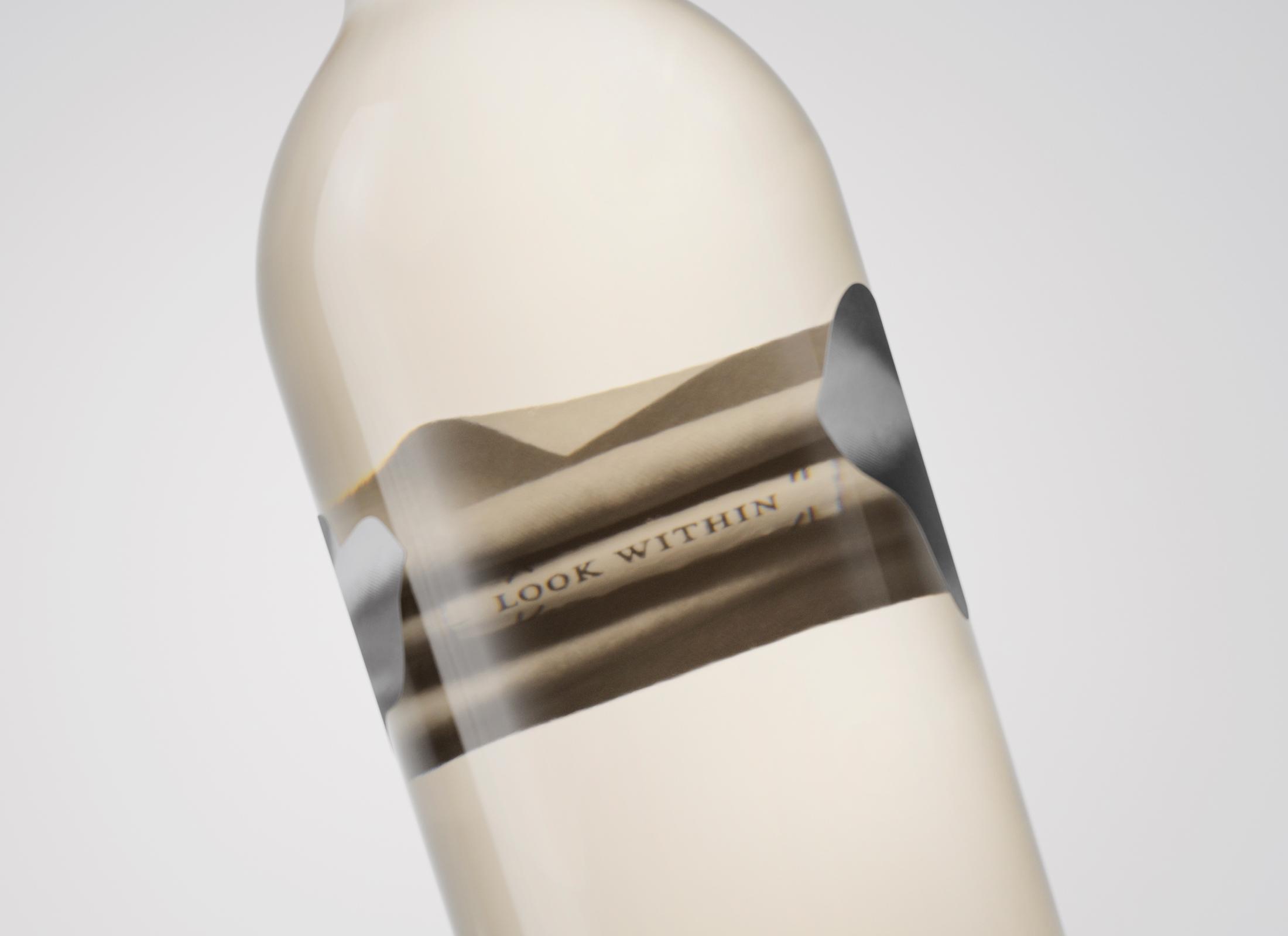
There’s a thought-provoking paradox in the notion of a blindfold. In removing sight, you're required to engage your senses in other ways – to look within.


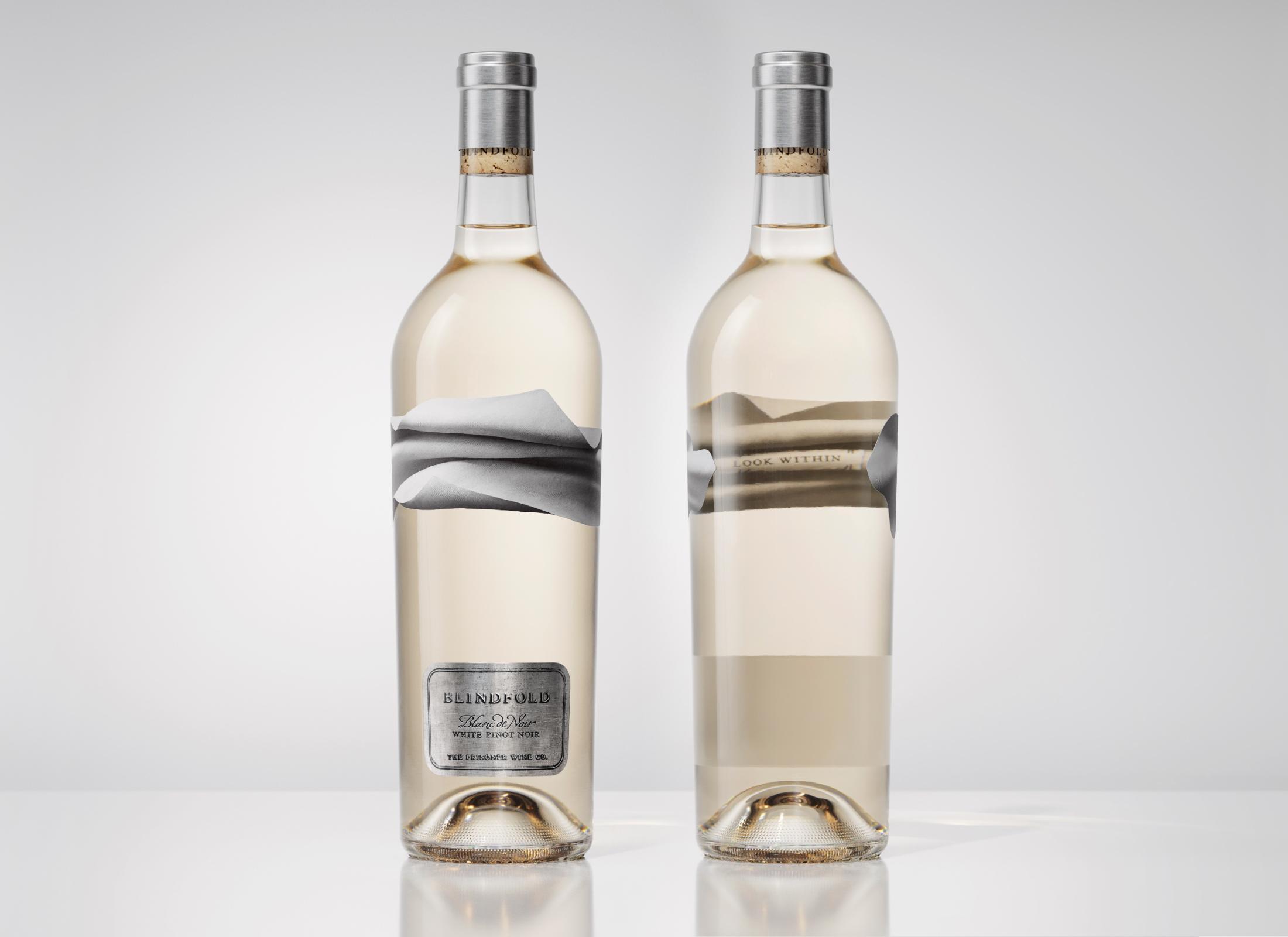
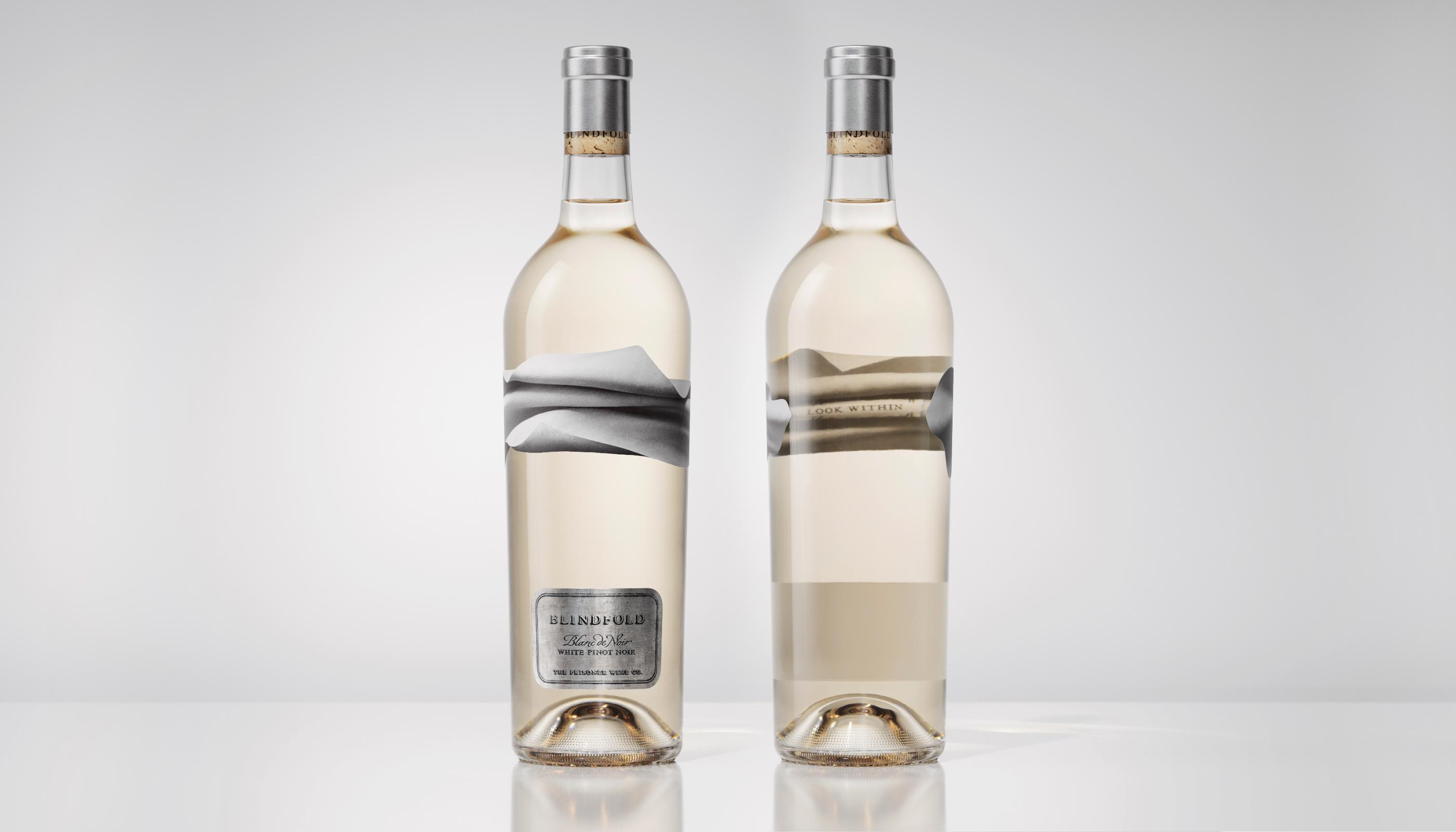
A leading force in the US luxury wine sector, The Prisoner Wine Company (TPWC) has never been one to follow convention when it comes to their wines or how they package them. Their progressive wine brands buck convention, with a dark, artful aesthetic and bold attitude.
Their portfolio had historically centred around indulgent full-bodied reds. However the market presented opportunity for TPWC to engage within the lighter brighter world of luxury white wine.
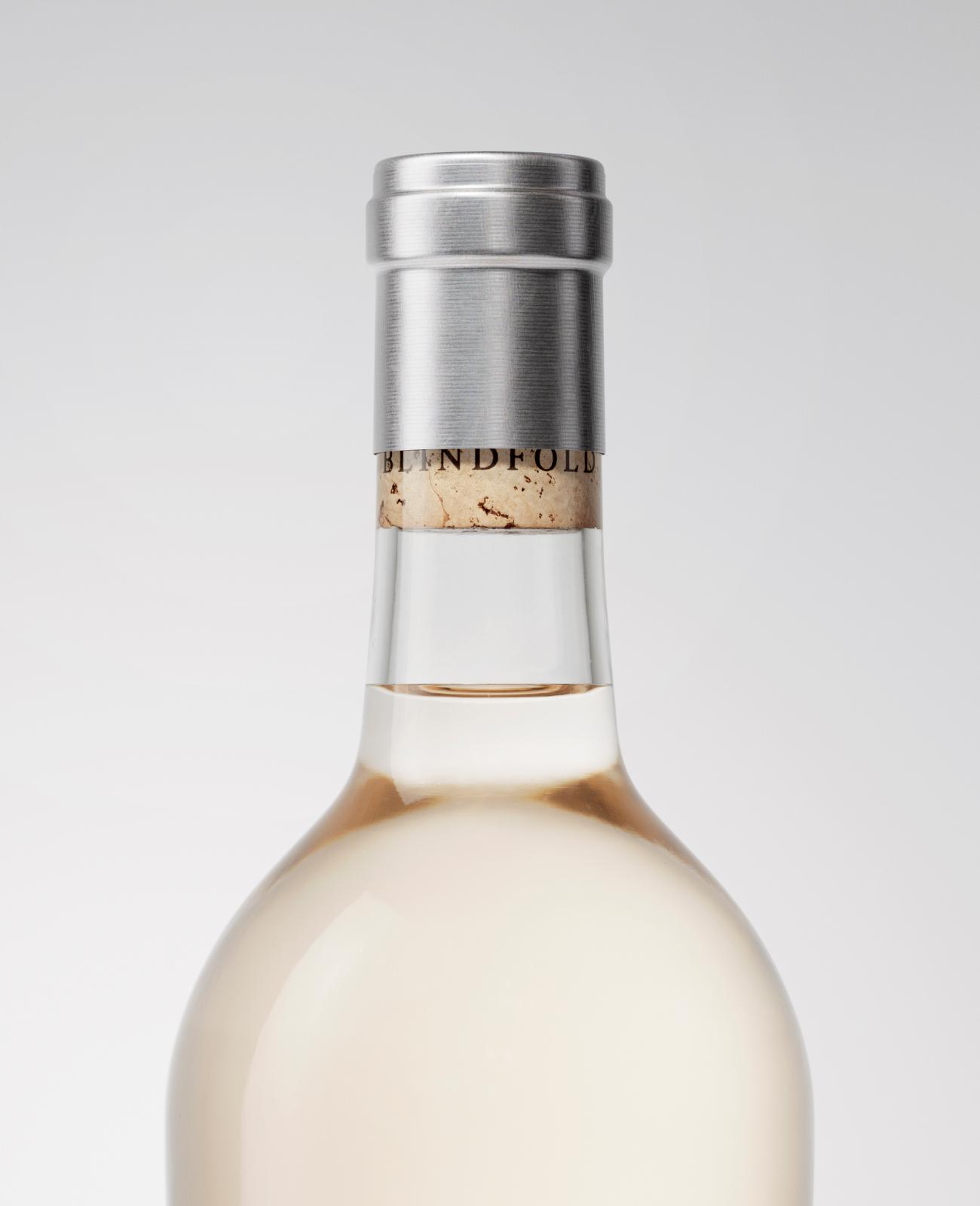
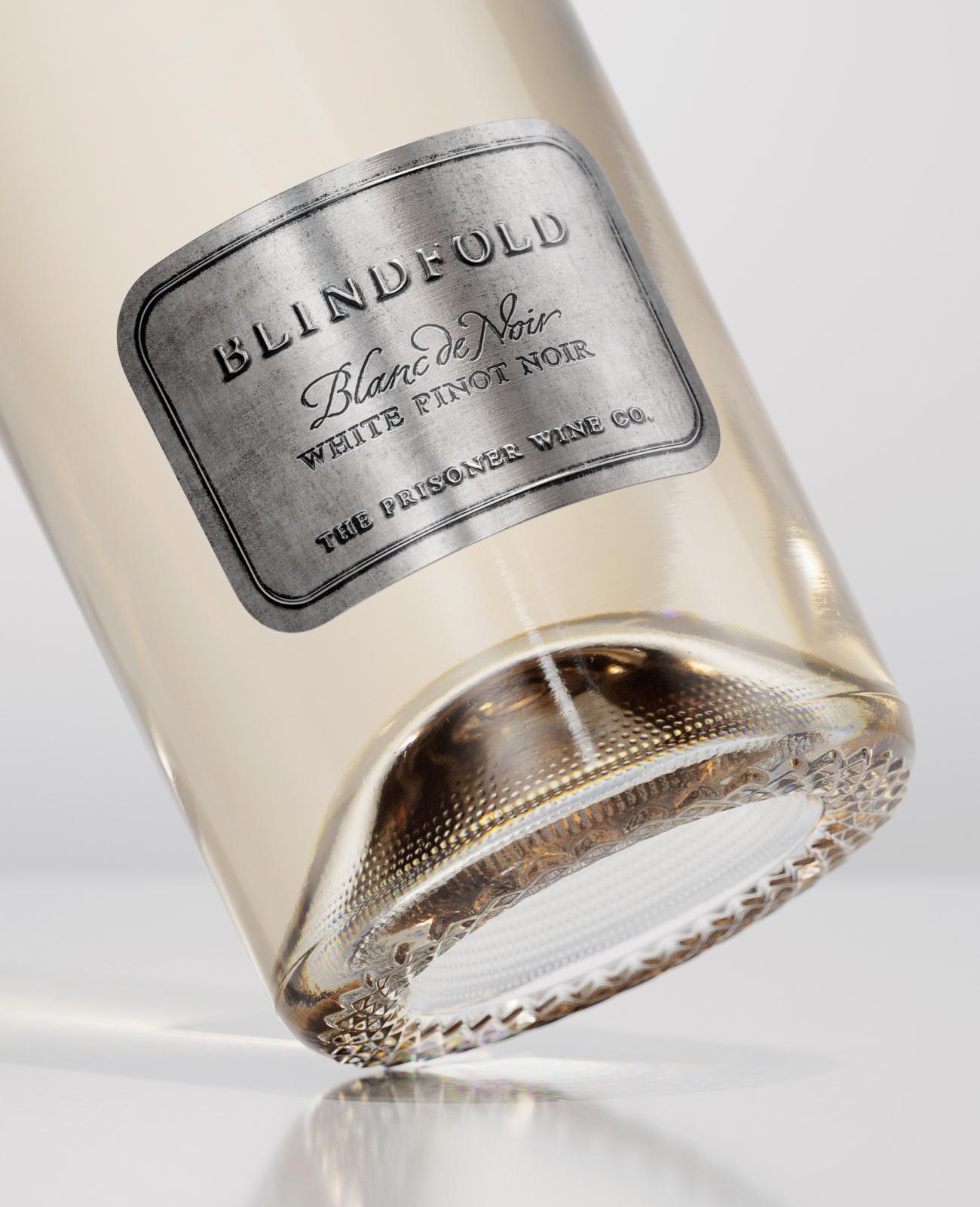
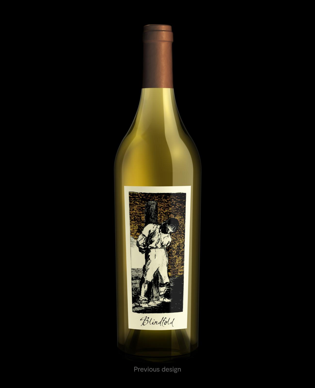
Blindfold had already existed in the portfolio as a standalone white wine available exclusively online and at the winery. However the previous wine proposition and packaging did not meet TPWC’s updated progressive brand ambitions.
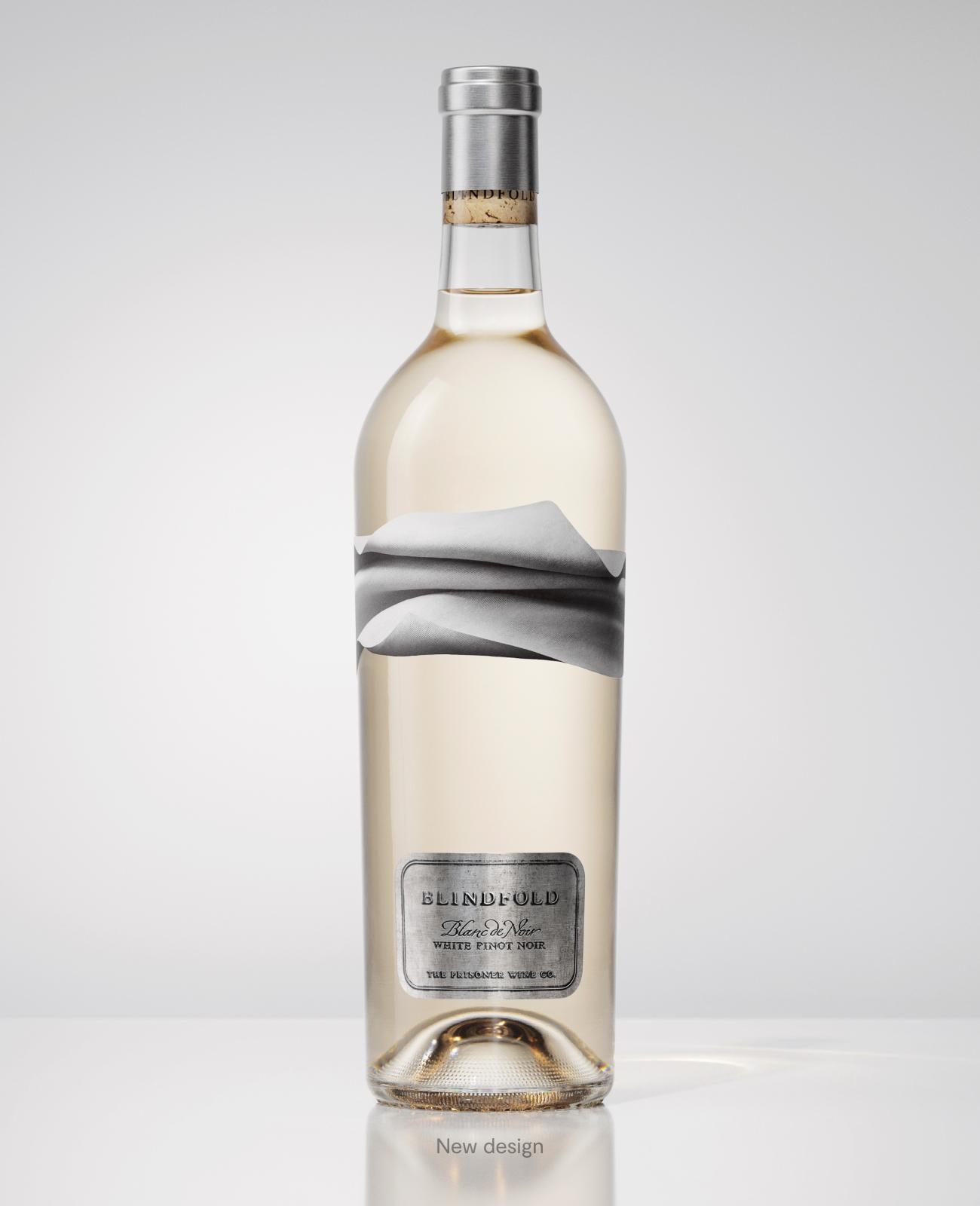
Our brief was to completely reposition Blindfold as a new entrant—one that balances the light appeal of luxury white wine with the dark and provocative edge of TPWC.
There’s a thought-provoking paradox in the notion of a blindfold. It requires you to engage your senses in another way. Inspired by this creative thought, our design solution is suggestive—to engage your senses in other ways and look within. A call to action for our audience to turn their attention inwards and awaken their senses.