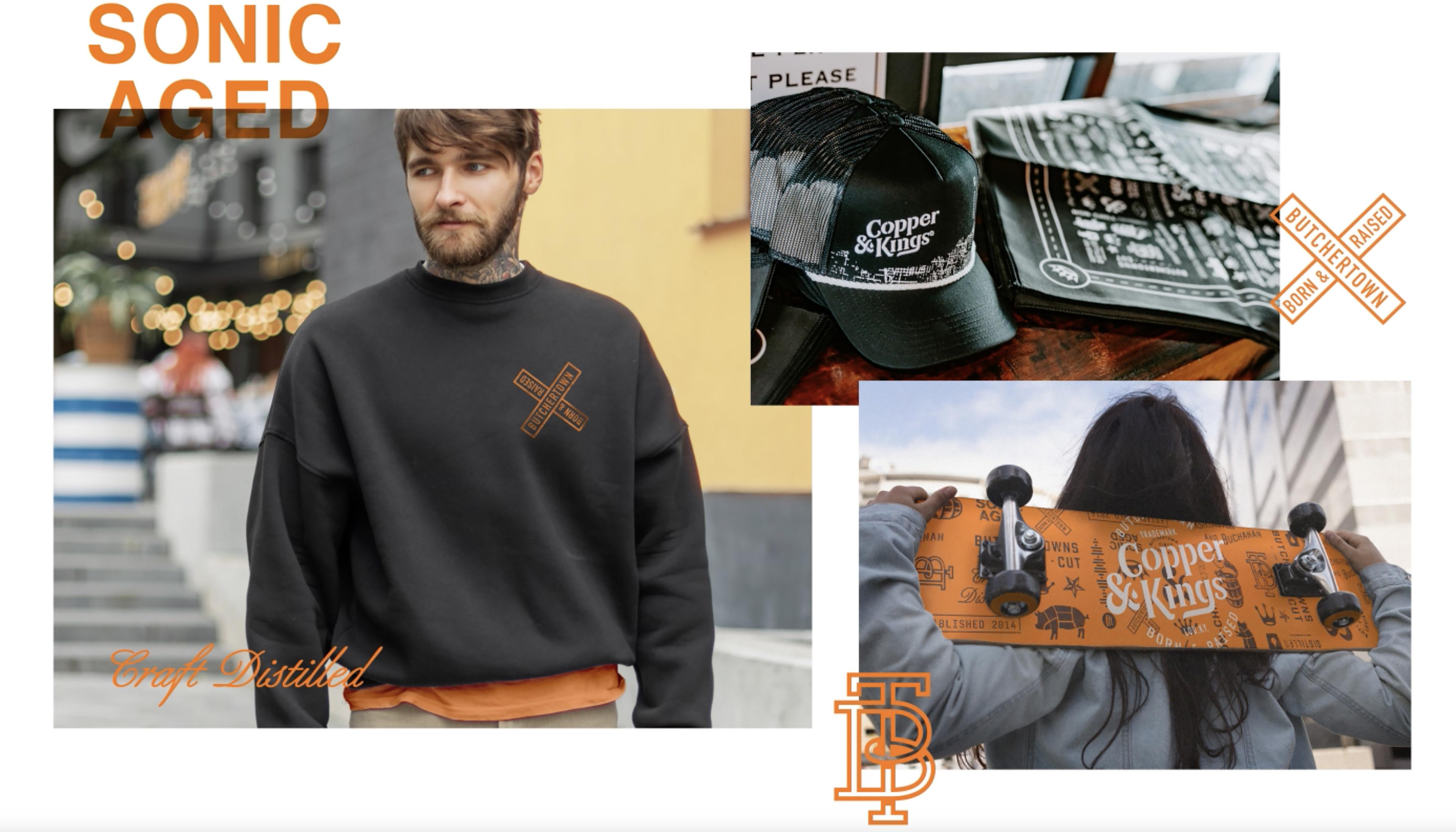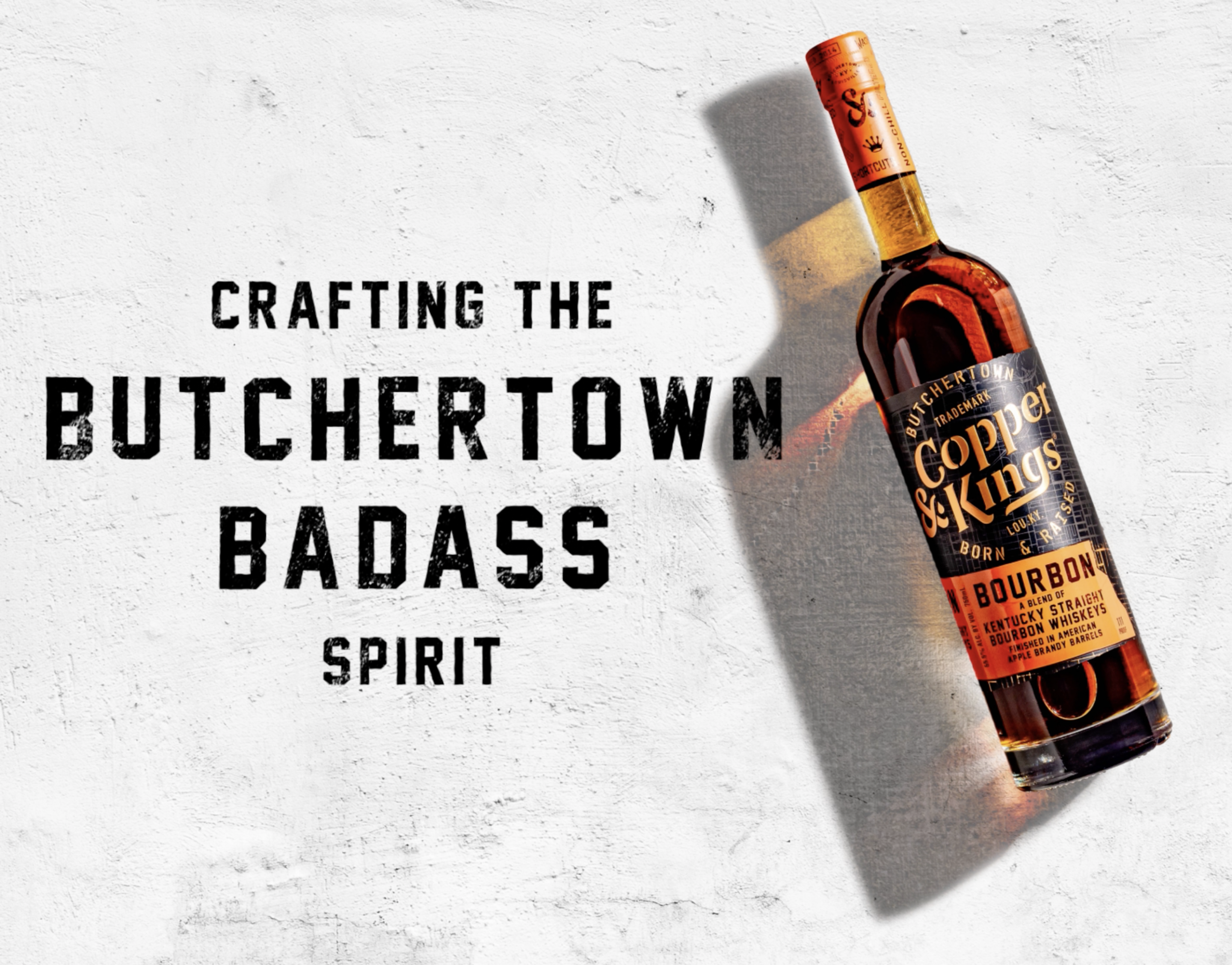

Brandies, Bourbon, and all things badass. Straight from the streets of Butchertown, Kentucky.
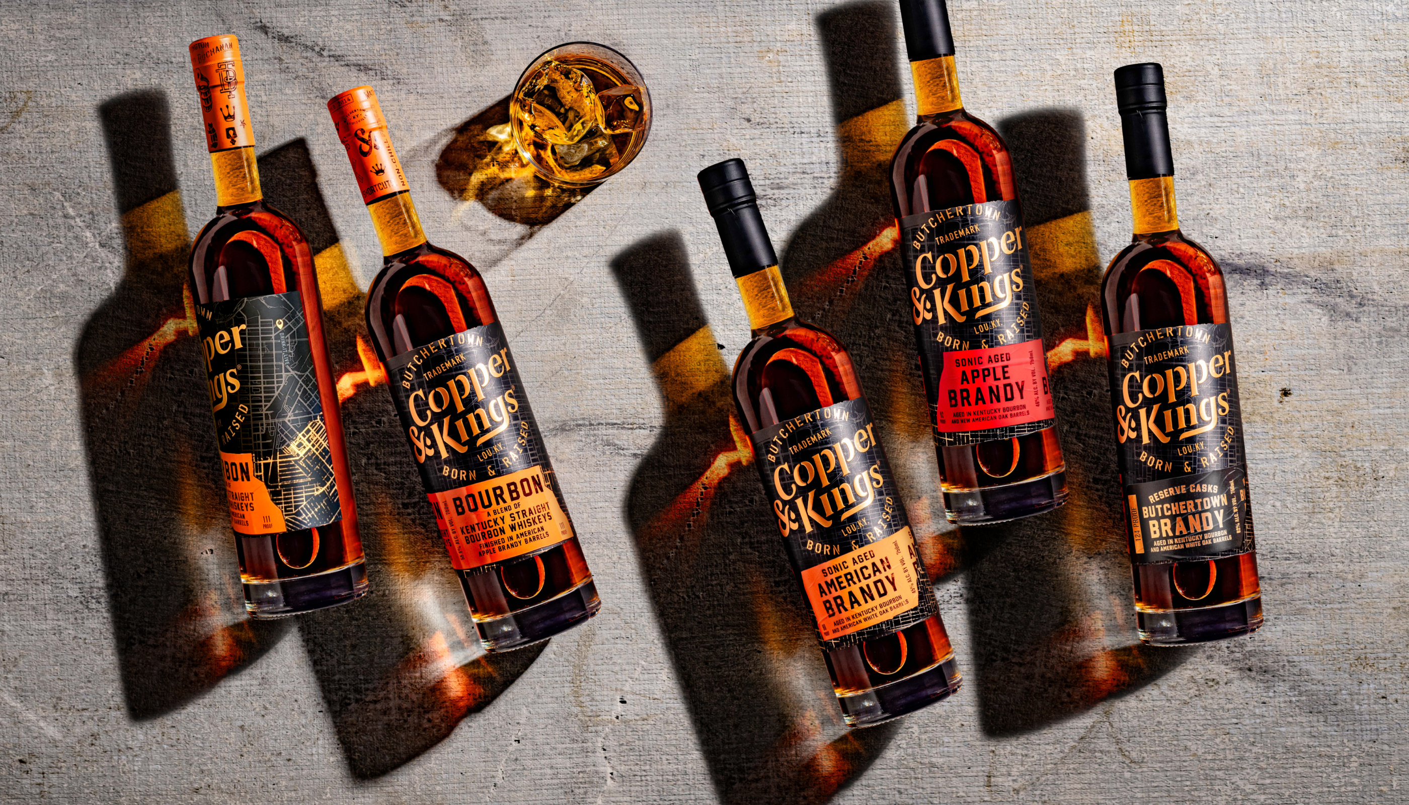
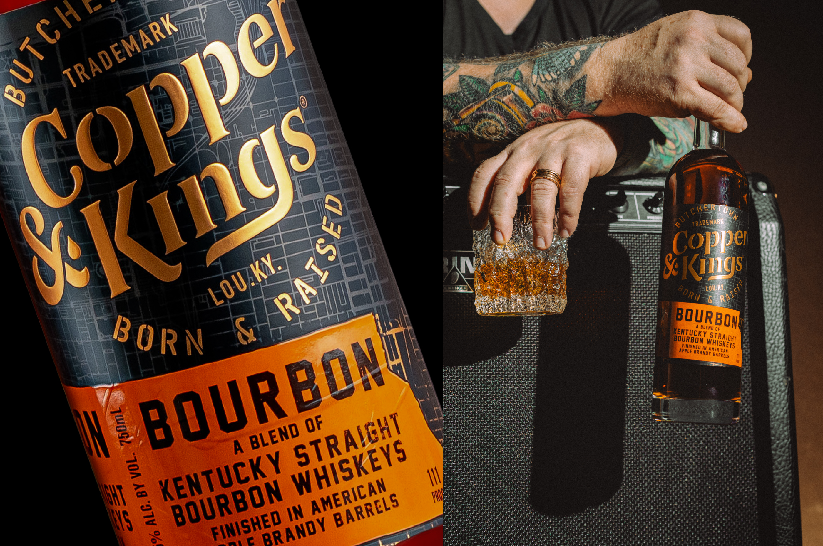
Copper & Kings are renowned for their American Brandies aged in Bourbon barrels. When the brand saw a natural opportunity to expand into the Bourbon category, they came to us. Their brief was for Bourbon packaging design, but given their authenticity and lifestyle appeal, we recognised an opportunity beyond packaging. Thinking brand first, we refreshed the identity to claim presence on shelf and digital, then built a suite of distinctive assets to amplify the Butchertown Badass spirit across multiple categories and touchpoints, setting up Copper & Kings for future growth.
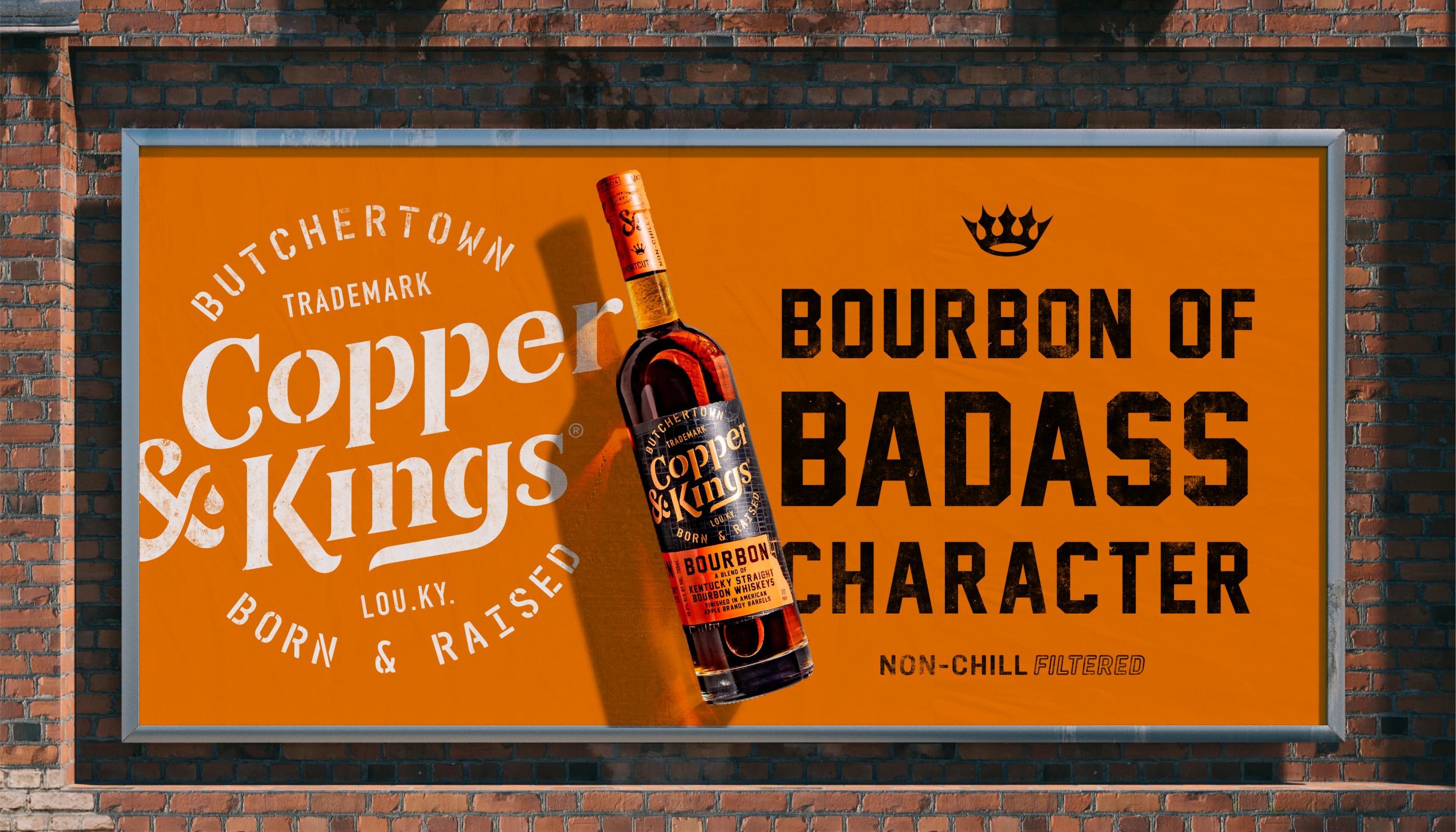

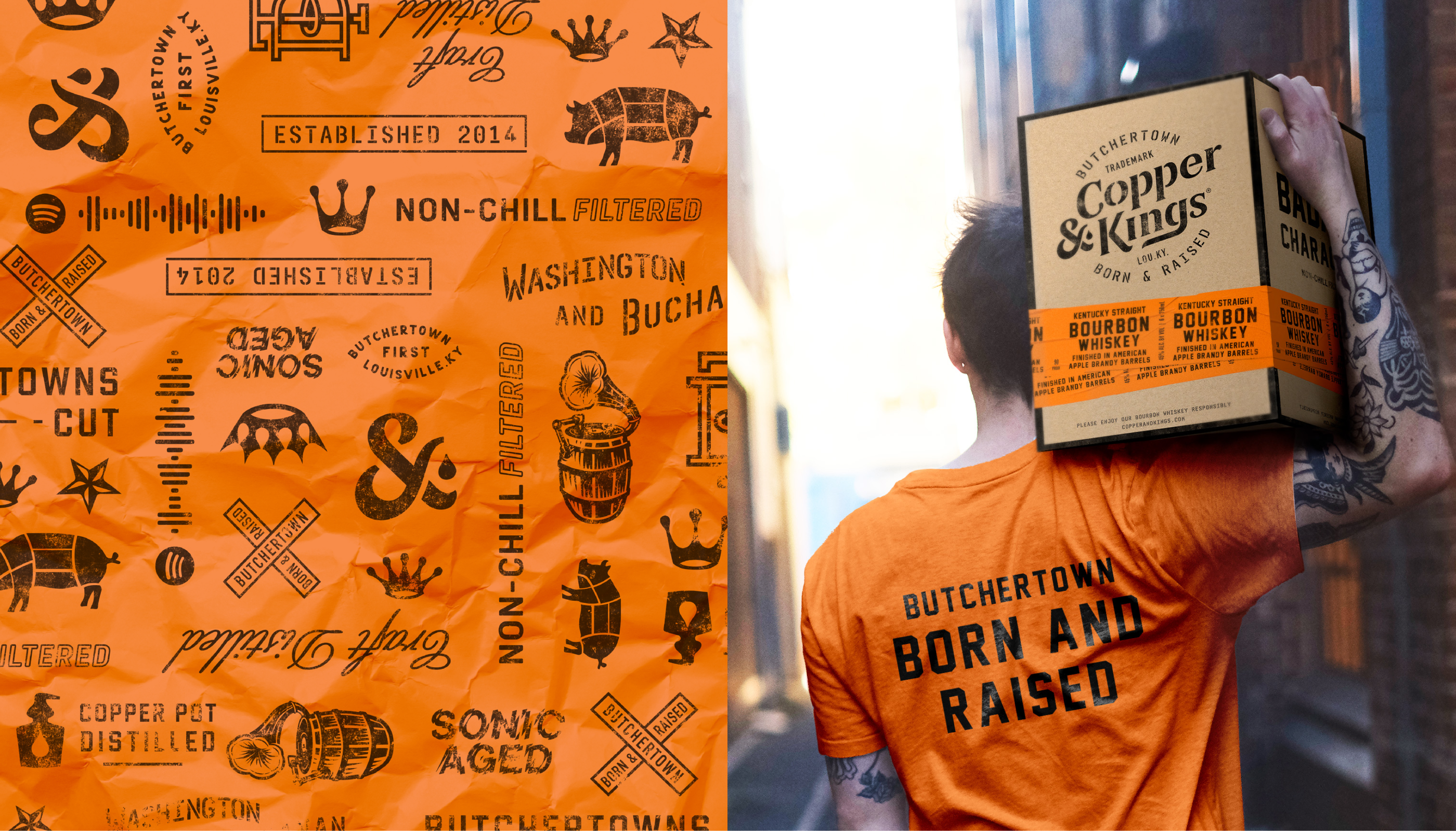
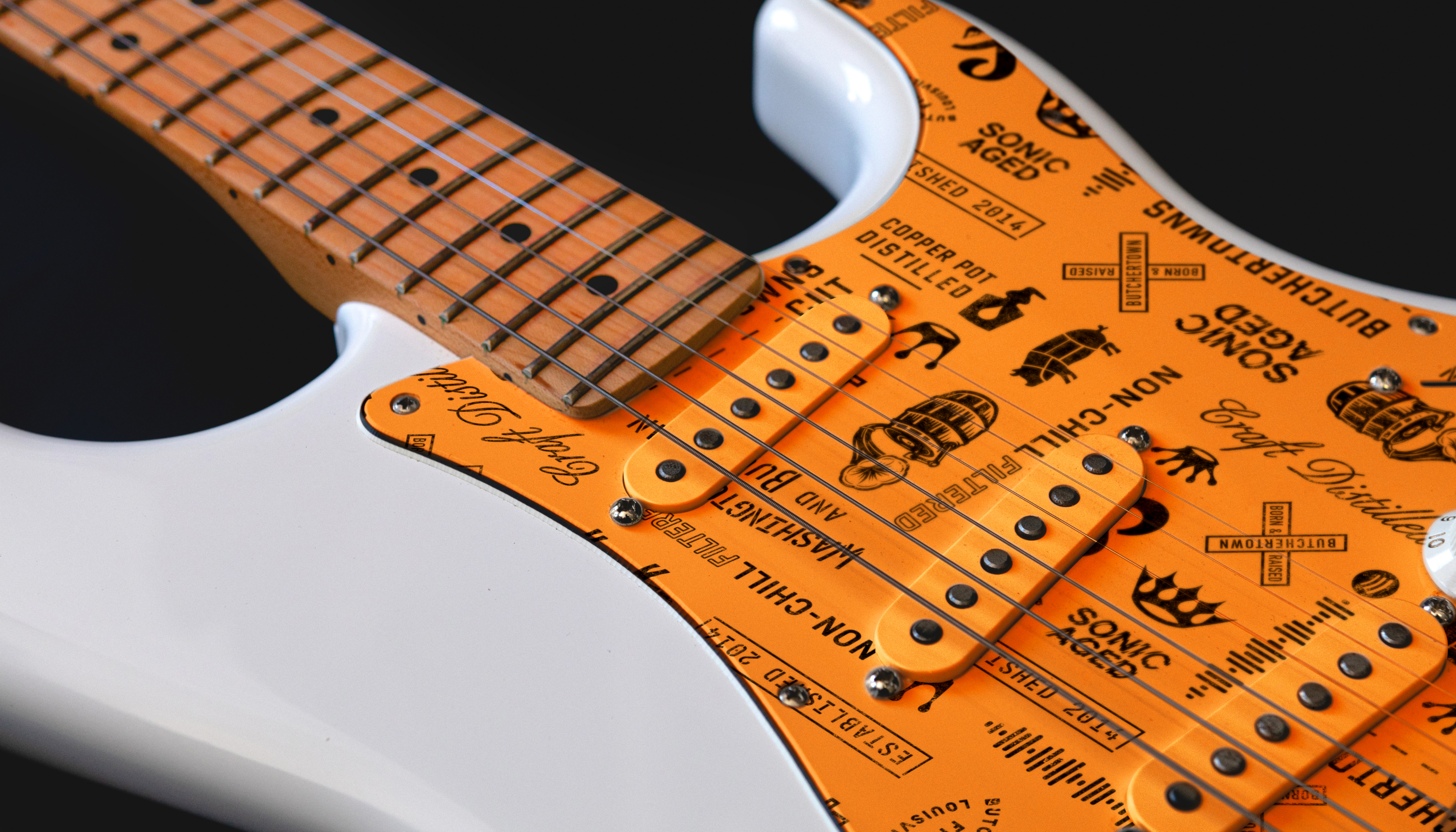
With this revitalised brand built to attract a cult following we refreshed packaging across Copper & Kings’ debut Bourbon and existing brandy portfolio. Inspired by their ties to Butchertown and the American music scene, the new visual language references gig posters, ticker tape, and sonic aging, their unique process of aging spirit with reverberations from sub-woofers. Aged in Kentucky barrels. Matured by rock 'n roll 🤘.